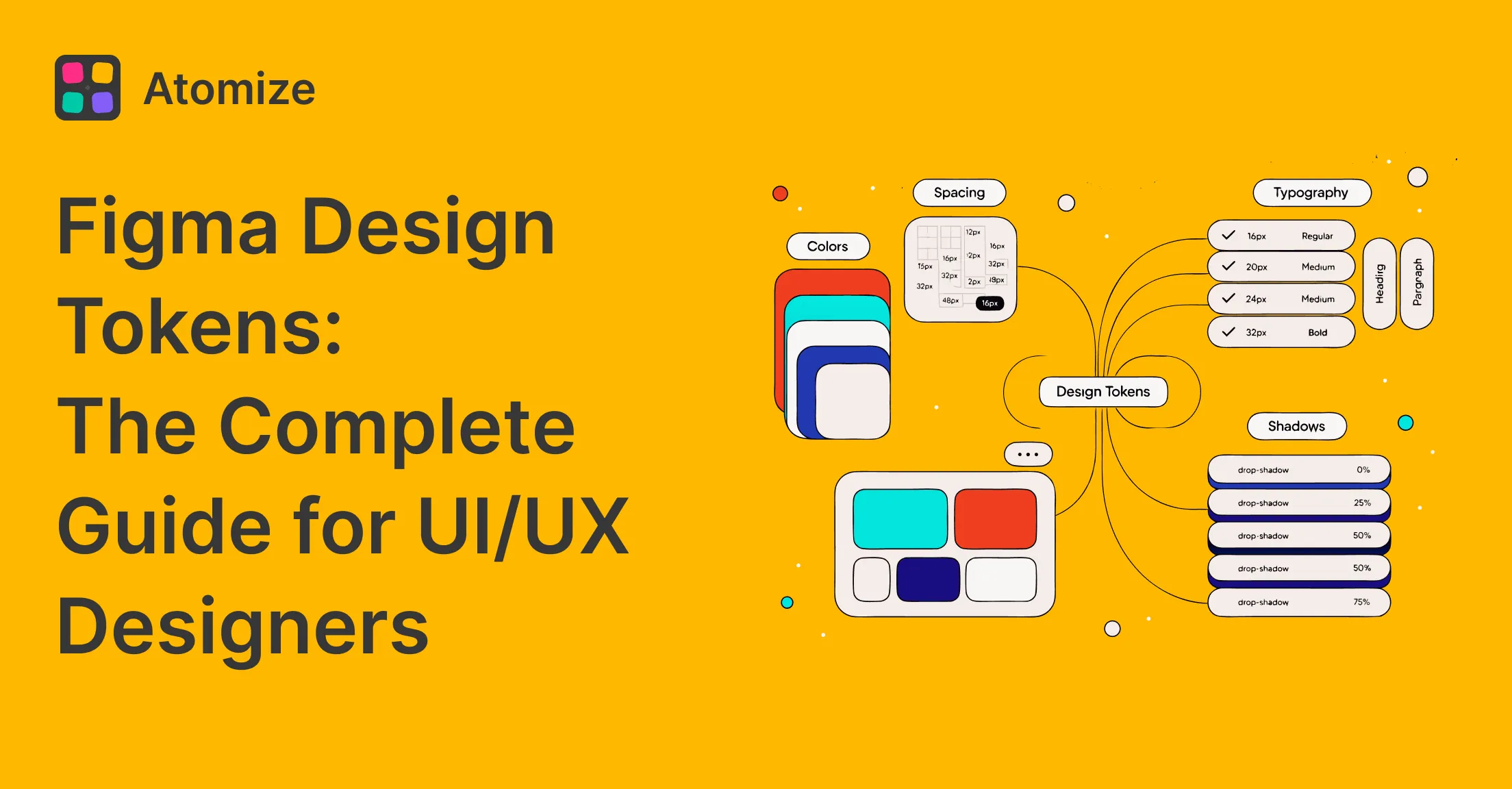
Figma design tokens are named, platform-agnostic slots for visual decisions - implemented natively as Variables - that decouple a token’s name from its value so a single collection update propagates instantly across every component. Switching to dark mode or applying a rebrand means editing values in one place, not hunting hex codes across hundreds of layers. This guide covers the full workflow: primitive vs. semantic layers, collections, modes, naming, scopes, code export, and the DTCG standard.
Related workflows: Figma vs Pencil for tooling choices, Figma MCP for AI in Dev Mode, WCAG contrast audits at library scale, and dark mode with Variables.
What Are Figma Design Tokens?
Design tokens are the shared contract between design and code - a named decision that both sides reference instead of raw values. The concept was popularized by the Salesforce Lightning Design System team and is now being standardized by the W3C Design Tokens Community Group (DTCG) so tools and codebases can exchange token files without custom parsers. In Figma, tokens live as Variables: a named slot holds the value, and every component that references it updates the moment the value changes. That indirection is what makes dark mode, density options, and rebrands manageable at scale.
Token indirection makes dark mode, density options, and rebrands manageable without rebuilding components. Update the value behind a token and every component that references it follows automatically.
Figma Variables vs Design Tokens: What’s the Difference?
Design tokens are the concept - a named decision (a color, a spacing value, a font size) that both design and code reference instead of a raw value. Figma Variables are the native mechanism that implements that concept inside Figma: a typed slot (Color, Number, String, or Boolean) that holds values and supports aliases and modes. Every Figma Variable you create is effectively a design token; the distinction matters when connecting Figma to a build pipeline, because not every token workflow requires Figma Variables - some teams maintain token files in JSON outside Figma entirely. Within a Figma-first workflow, the two terms are used interchangeably in practice.
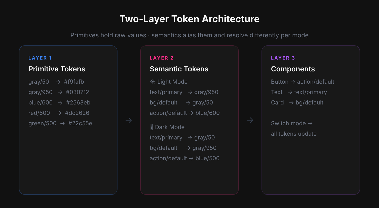
Primitive vs Semantic Tokens
Every production-grade token system needs two layers - primitives and semantics - or the first theme request breaks everything. Primitives hold raw values with no product meaning (palette steps, spacing increments, type sizes); semantics alias them by UI role (page background, primary action, destructive text). Without that separation, components bind directly to raw values, and adding a second theme means manually overriding each one. When building Atomize, Vitalina reviewed hundreds of Figma libraries and found most had primitives but no semantic layer - buttons were wired to blue/600 instead of interactive/default, so dark mode required component-level surgery rather than a mode switch. Keep the two layers distinct and every future theme change stays confined to the semantic collection.
The semantic layer was absent in the majority of real Figma libraries reviewed while building Atomize. Most had a Primitives collection - raw palette steps - but components were wired directly to those Primitives. A button fill referencing blue/600 instead of interactive/default looks identical in light mode but breaks the moment you try to add a second theme: every component needs a manual override rather than a mode switch. The two-layer architecture feels like extra work upfront; it pays back immediately the first time someone asks for a dark mode toggle.
Color
Primitives hold raw palette steps with no product meaning. Semantics alias them by UI role. A button fill references interactive/default, never a hex - so dark mode is just a mode switch on the semantic collection with zero component changes.
/* Primitives */
gray/50   →  #f9fafb
gray/950  →  #030712
blue/600  →  #2563eb
red/600   →  #dc2626

/* Semantic - Light mode */
background/default       →  gray/50 (#f9fafb)
text/primary             →  gray/950 (#030712)
text/subdued             →  gray/600 (#4b5563)
interactive/default      →  blue/600 (#2563eb)
interactive/destructive  →  red/600 (#dc2626)

/* Semantic - Dark mode (same names, different values) */
background/default       →  gray/950 (#030712)
text/primary             →  gray/50 (#f9fafb)
Typography
Primitive type sizes: font/size/12, font/size/14, font/size/16, font/size/20, font/size/24, font/size/32. Semantic presets: text/body/sm uses font/size/12, weight/regular, lineheight/150%; text/body/md uses font/size/14; text/heading/lg uses font/size/24, weight/semibold, lineheight/110%. Presets bundle primitives so your product uses a controlled subset of the full scale.
Spacing, radius, elevation, motion
Spacing, radius, and motion use Number variables so auto-layout padding, gap, corner radius, and effect fields stay on-scale automatically.
/* Spacing - Number variables, base-4 scale */
space/1= 4px
space/2= 8px
space/3= 12px
space/4= 16px
space/6= 24px
space/8= 32px
space/12= 48px
space/16= 64px

/* Radius */
radius/none= 0
radius/sm= 4px
radius/md= 8px
radius/lg= 12px
radius/full= 9999px

/* Motion duration */
duration/fast= 150ms
duration/base= 250ms
duration/slow= 400ms
Figma Variables as Your Token Engine
Figma Variables are the native token engine - four types (Color, Number, String, Boolean) grouped into collections, each supporting multiple modes for parallel value sets. Most teams underuse this: they create color variables but leave spacing and radius as raw numbers, so auto-layout stays off-scale and padding drifts between designers. Atomize users who fully populate Number collections for space, radius, and motion see component reviews drop from hours to minutes because every value traces back to a named token. Alias primitives into semantics using the variable picker (the cube icon) so the relationship is explicit, navigable, and enforced inside the file.
Minimal collection setup
- Create “Primitives - Color”: raw palette steps, no modes. Restrict editing to system owners.
- Create “Semantic - Color”: variables aliased to primitives. Add Light and Dark modes; set values per mode.
- Create “Primitives - Space”: Number variables for your spacing scale.
- Create “Primitives - Radius” and “Primitives - Motion” as Number variables.
- On each component, bind fills, strokes, padding, gap, corner radius, and text to Variables - never to raw values.
Modes: theming without duplicate components
Modes live on a collection and define parallel value sets. The Semantic - Color collection has Light and Dark modes; every semantic variable gets two values. Apply mode at frame level to preview the whole flow in dark theme without touching a single component. Add modes only when the whole collection needs parallel values; unrelated axes (color themes vs. density) belong on separate collections.
Scopes: where a variable is allowed
Scopes control which design properties a variable appears in. A text color variable scoped to “Text fill” will not show up in the stroke picker. A spacing variable scoped to “Gap” and “Padding” will not appear in corner radius. Tight scopes prevent accidental misapplication and reduce picker noise as the library grows.
How to Set Up Design Tokens in Figma: Step by Step
- Create a Primitives - Color collection: raw palette steps (gray/50 through gray/950, blue/600, red/600). No modes, no aliases - just values. Restrict edit access to system owners.
- Create a Semantic - Color collection: add Light and Dark modes. Alias each semantic variable to a primitive using the cube icon in the value picker - never enter hex values directly.
- Create Primitives - Space and Primitives - Radius collections using Number variables. Set your spacing scale (4, 8, 12, 16, 24, 32, 48, 64) and radius steps (0, 4, 8, 12, 9999).
- Bind every component: fills and strokes to Semantic - Color variables, padding and gap to Primitives - Space, corner radius to Primitives - Radius. Never bind a component directly to a Primitive - Color variable.
- Set up export: use Atomize or right-click a collection → Export to JSON to generate CSS custom properties, TypeScript constants, or DTCG JSON. Add this step to your library publish checklist so token files stay current with every release.
Naming Tokens
Token names are the public API shared by designers and developers - bad names create drift that silently breaks theming. The constraint is that semantic names must stay meaningful across every mode: text/gray is wrong because it stops making sense the moment you add a dark theme; text/subdued is correct because it describes intent, not a hue. The category/role/variant pattern (color/text/primary, spacing/gap/md) maps directly to CSS custom property conventions (--color-text-primary), so Figma paths and code names stay in sync with no translation layer. Agree on casing and naming conventions once, document them in variable descriptions, and enforce them in library reviews.
The most common bad naming pattern Atomize flags in audits is hue-encoded semantic names: text/blue, border/gray-300, background/white. These pass review in light mode because the name and the resolved value happen to agree. They break silently the moment a dark mode value is assigned - the variable still exists and resolves to something, but the name now lies about what it points to. The first time an engineer opens browser devtools and sees --text-blue resolving to near-white, engineering trust in the token system is damaged. Rename with a deprecation window, document the role-based replacement in the variable description, and remove the old name on the next major version.
Exporting Tokens to Code
Tokens only become a shared contract when the same names ship in the codebase - a token that exists only in Figma is a private note. Without a sync pipeline, design updates and code values drift apart silently: engineers hard-code hex values because they can’t reliably read the Figma file, and the token system becomes decorative. Atomize reads your Figma Variables directly and exports structured token files - JSON, CSS custom properties, or TypeScript constants - so the repository always reflects the current library state without manual copy-paste. Connect the pipeline once and every library publish becomes a code update.
A typical CSS export from a semantic color collection. In dark mode the same variable names resolve to different values - the app switches themes by toggling a data attribute, not loading a second stylesheet.
/* Semantic color tokens - Light mode */
--color-background-default:     #f9fafb;
--color-text-primary:           #111827;
--color-text-subdued:           #4b5563;
--color-interactive-default:    #2563eb;
--color-interactive-destructive: #dc2626;

/* Dark mode: toggled via [data-theme="dark"] on <html> */
[data-theme="dark"] {
  --color-background-default:   #030712;
  --color-text-primary:         #f9fafb;
  --color-text-subdued:         #9ca3af;
  --color-interactive-default:  #3b82f6;
}
A token only in Figma is a private note. A token in Figma and in the build pipeline is a shared contract.
Token export formats compared
| Format | Best for | Tool support | Key limitation |
|---|---|---|---|
| CSS custom properties | Web projects, all modern browsers | Atomize, Style Dictionary, all major tools | No token type metadata; does not compile for native platforms |
| DTCG JSON | Multi-platform pipelines (web, iOS, Android) | Style Dictionary, Theo, Token Transformer | Requires clean $type on every token; strict structure |
| TypeScript constants | Type-safe codebases, design token autocomplete | Atomize, custom build scripts | Build step required; not useful for CSS-only projects |
| SCSS variables | Legacy web projects, design-heavy stylesheets | Most export plugins | No aliasing support; values duplicate rather than reference |
Best Practices
- Ship primitives before semantics; alias, never duplicate raw values in components.
- Restrict edit access to primitive collections; day-to-day work happens on semantics.
- Use variable descriptions for intent, contrast pairings, and deprecation notices.
- Version token exports alongside library releases - same cadence, same changelog.
- Tokenize recurring decisions; one-off edge cases do not need a token.
- Audit annually: merge duplicates, delete unused tokens, document any breaking renames.
Common Pitfalls
- Binding primitives directly on components - you lose the semantic indirection; theme switches require manual component edits.
- Too many modes on one collection - split unrelated axes (color themes vs. density) into separate collections.
- String variables for every number - use Number type for space and radius so auto-layout math stays consistent.
- Hue words in semantic names (text/blue, background/white) - break when the palette changes.
- No export pipeline - engineering invents parallel names; drift is guaranteed.
DTCG Interoperability
DTCG compliance future-proofs your token system against toolchain changes by establishing a portable, parser-agnostic JSON format. Most teams today use proprietary export schemas tied to a single plugin - when that plugin is deprecated or a new platform is added, the entire token file must be manually migrated. The W3C DTCG specification gives every token a $value and a $type (color, dimension, duration, shadow, etc.), and tools like Style Dictionary and Token Transformer read that format natively without custom parsers. Figma’s Variable export direction aligns with DTCG, so category/role/variant naming maps cleanly to the group hierarchy and survives toolchain swaps with no renaming. Structure your tokens as if they will leave Figma - because eventually they will.
Related Reading
- Coverage Audit vs Untokenized Values - when to use each Atomize audit and the recommended order before contrast checks
- How to Build a Design System in Figma - step-by-step library setup after your token layers exist
- Find Untokenized Values in Figma - audit token coverage before you export or ship modes
- Figma Plugins for Tokens, Git Sync & Design Workflows - export, Git sync, and pipeline plugins
Final verdict - Figma Design Tokens
Design tokens built on a two-layer architecture are the only foundation that scales - primitives hold raw values, semantics own product intent, and the gap between them is where dark mode, rebrands, and density variants live for free. The investment is front-loaded: getting the collections, naming, and export pipeline right in the first sprint means every future change is a value edit rather than a component surgery. Atomize users consistently report that the first full token export to CSS is the moment the design system stops being a Figma artifact and starts being a shared engineering asset. Build the structure early, treat the token file as source-of-truth, and the system pays compounding returns for the life of the product.