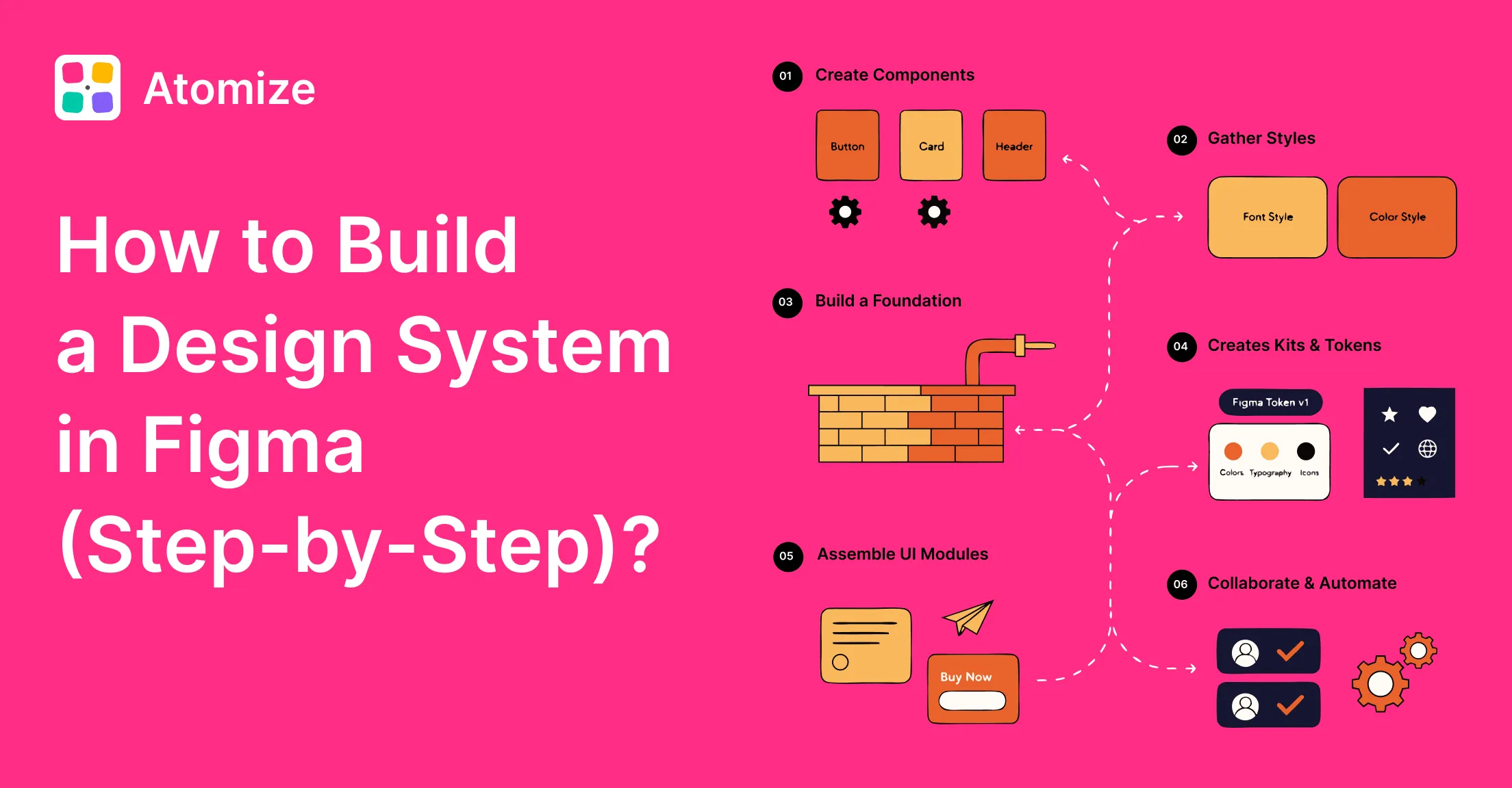
To create design system Figma libraries that scale, complete nine steps in order: audit existing UI, create a dedicated library file, define primitive and semantic design token layers as Variables, assemble core components that bind to those tokens, govern variants with Component Properties, document inside the file, publish the team library, assign an owner, and export tokens to code. That sequence is not stylistic - each phase depends on the previous one, and the two most expensive failure modes (components built before tokens, libraries without a named owner) both come from skipping earlier steps. Teams that follow the order ship a usable first release in two to four weeks and expand it incrementally from there.
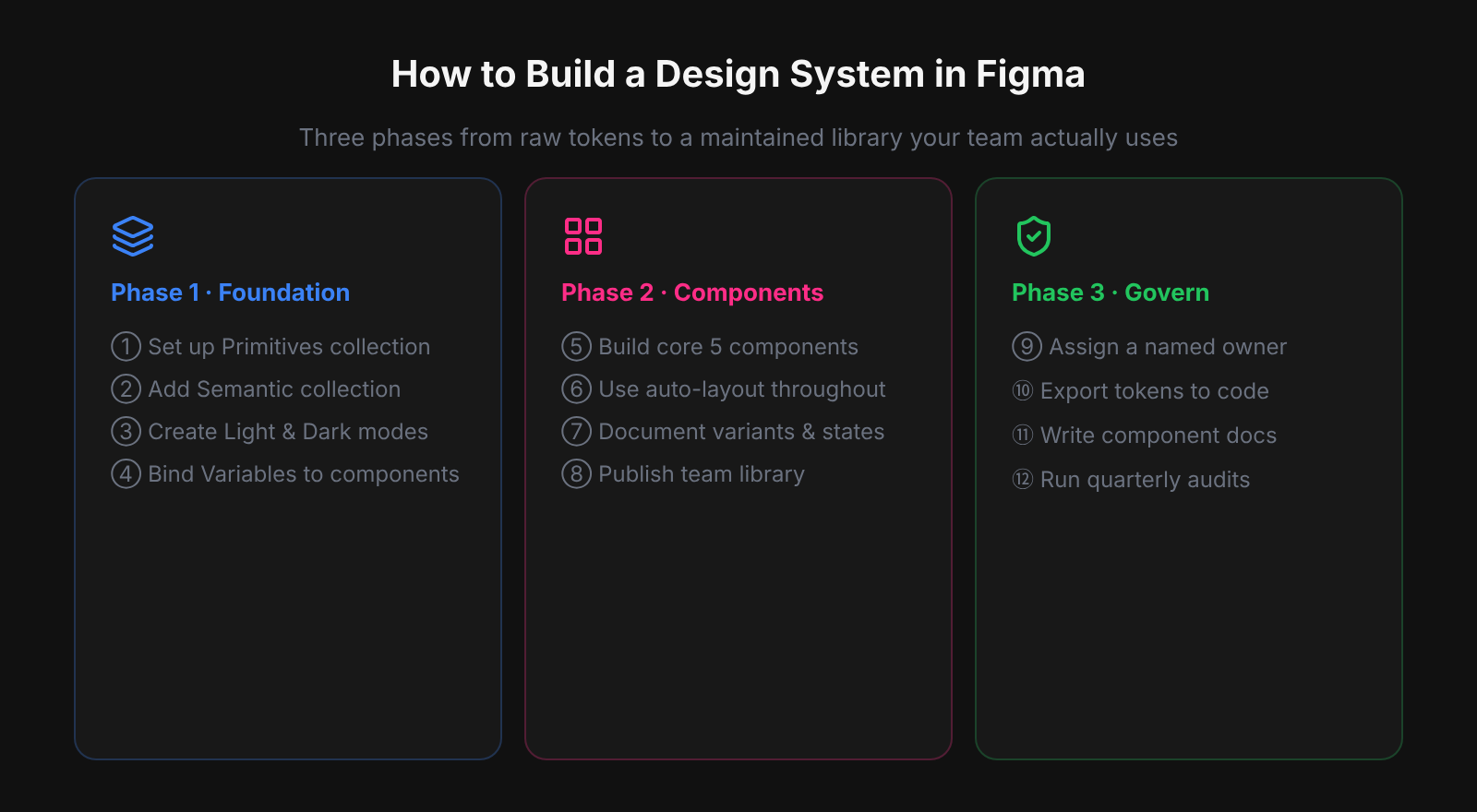
The single most common mistake we saw when auditing design systems at Atomize was components built before the token layer existed. A team would spend weeks crafting a thorough component library - careful auto-layout, complete variants, thoughtful documentation - and then attempt to add Variables and Modes on top. At that point every component fill is a hardcoded hex value. The migration is not just tedious; it is a source of regressions, because rebinding fills one component at a time with no automated verification means some fills get missed, and the mismatch only surfaces when a mode switch produces a visually broken component. Tokens-first is not a stylistic preference; it prevents an expensive class of rework.
Related workflows: Figma design tokens guide (pre-requisite: primitive/semantic layers), what a design system is in Figma (conceptual foundation), and Figma design system best practices (governance and maintenance habits after the build).
Step 1: Audit the Current UI
A thorough audit prevents the most expensive design system mistake: discovering undocumented value divergence after components are already built. Without an inventory, teams unknowingly build on a fractured foundation - three near-identical primary buttons, four informal gray shades - and every component they add locks in that inconsistency deeper. At Atomize, audits routinely surface 30-60 distinct color values where teams expected fewer than fifteen. Collect every hex, font size, spacing hack, and border radius from production files before writing a single Variable.
Use a Figma canvas to collect screenshots side by side. A simple spreadsheet counting unique values (how many blues, how many button variants) makes scope visible. Prioritize by blast radius: navigation, forms, and feedback components appear on nearly every screen - stabilize those foundations first.
Step 2: Create the Dedicated Library File
Separating the design system into its own Figma file is the structural decision that makes every subsequent step tractable. When masters live inside product files, the update path breaks the moment a second product team joins - there is no single source to publish from. A dedicated library file with a predictable page structure (Foundations, Components, Patterns, Documentation, Archive) gives every contributor a shared mental model and keeps the publish workflow clean. Without this separation, governance has nothing to govern.
- Foundations - Variables (tokens), text styles, color styles, effect styles.
- Components - all published master components, organized by category (Actions, Inputs, Navigation, Feedback, Data Display).
- Patterns - screen-level compositions and reusable layouts.
- Documentation - do/don’t frames, anatomy diagrams, spacing callouts, contribution guidelines.
- Archive - deprecated components held during a migration window before deletion.
Product files stay downstream and consume instances. Never build masters inside a product file; the moment you do, the update path breaks.
Step 3: Define Tokens with Figma Variables
Tokens defined as Figma Variables before any component is built are what make theming, rebranding, and multi-mode layouts achievable without touching component fills. A single-layer approach - components binding directly to raw hex values - works until the first dark-mode request or rebrand, at which point every fill must be manually updated. The two-layer model (primitives for raw scales, semantics for role-based aliases) means a theme flip changes one collection and propagates instantly. At Atomize, we saw teams cut rebrand turnaround from days to under an hour after migrating to this structure. Define primitives first, then semantics, then bind components exclusively to semantics.
Primitive collections
Raw scales with no product meaning: “Primitives - Color” (gray/50-950, blue/100-900, red, green), “Primitives - Space” (4, 8, 12, 16, 24, 32, 48, 64 as Number variables), “Primitives - Radius” (0, 4, 8, 12, 9999). Restrict editing to system owners.
Semantic collections
UI-role aliases: “Semantic - Color” with background/default → gray/50 (Light) / gray/950 (Dark), text/primary → gray/950 / gray/50, interactive/default → blue/600, interactive/destructive → red/600. Components bind to these semantics only - that is what makes theme flips and rebrands survivable without touching a single component.
Typography
Number variables for font size (12, 14, 16, 20, 24, 32) and line height. Pair with text styles for complete presets (body/md, heading/lg) that reference the primitive sizes so changing the base scale propagates automatically.
/* Step 3 summary: Primitive → Semantic alias chain */

/* Primitives — raw palette steps, no product meaning */
gray/50   →  #f9fafb
gray/950  →  #030712
blue/600  →  #2563eb
red/600   →  #dc2626
space/4   =  4px
space/8   =  8px
radius/md =  8px

/* Semantics — aliased by UI role, modes on this collection */
background/default       →  {gray/50}    /* Light: gray/50, Dark: gray/950 */
text/primary             →  {gray/950}   /* Light: gray/950, Dark: gray/50 */
interactive/default      →  {blue/600}   /* Light: blue/600, Dark: blue/400 */
interactive/destructive  →  {red/600}    /* Light: red/600, Dark: red/400 */
spacing/component-gap    →  {space/4}    /* 4px, no mode needed for spacing */
radius/button            →  {radius/md}  /* 8px, shape stays constant */
Step 4: Build Core Components
Components built on top of a complete token layer are the only kind that survive a theme change or rebrand intact. Without tokens in place first, every fill is a hard-coded value - and each one becomes a manual update the moment the brand palette shifts. The core set (Button, Input stack, Selection controls, Surface, Navigation, Feedback, Supporting atoms) covers 80% of product screens; every component uses auto-layout with all fills, strokes, radii, gaps, and padding bound to a Variable. Hard-coded values are where themes break.
- Button - hierarchy variants (primary, secondary, ghost, destructive); state variants (default, hover, focus, disabled, loading); props for icon and label.
- Input stack - label, field, hint text, error message as a real form anatomy unit.
- Selection controls - checkbox, radio, toggle, select/dropdown.
- Surface - card with configurable padding and optional header/footer.
- Navigation - top bar and/or side rail depending on your product shape.
- Feedback - toast, inline alert, banner in all four severities (info, success, warning, error).
- Supporting atoms - badge, tag, avatar.
The binding step teams most often miss on core components is padding. In Atomize’s component audits, fills and strokes get bound to Variables during construction because a wrong color is visually obvious. Padding values get typed in once and never revisited - quietly falling off the token scale as the spacing system evolves. A button with perfect color tokenization and four manually-typed padding values will not respond to a Density mode switch and will produce incorrect CSS output on the first token export. Bind every padding side and gap to a Number Variable before publishing.
Step 5: Variants vs Component Properties
Using Component Properties for booleans and instance swaps instead of multiplying variants keeps the component set small enough to maintain long-term. Variants encode meaningful layout or hierarchy differences - primary vs. ghost is a real structural distinction - but a separate variant for every icon-present / icon-absent combination multiplies the master count without adding design value. In practice, a Button with 4 hierarchy variants and boolean properties for icon, loading, and full-width covers nearly all product needs; the same coverage via variants alone would require 40+ masters. Fewer masters means fewer frames to update when a token or spacing rule changes.
A button with 3 hierarchy variants × 5 state variants = 15 components to keep current. Three variants plus properties is almost always enough.
When to use variants vs component properties
| Use case | Variants | Component properties |
|---|---|---|
| Distinct layout or hierarchy level (Primary vs Ghost) | Yes | No |
| Show/hide an element (icon, loading state) | No | Yes (Boolean) |
| Swappable slot (icon instance) | No | Yes (Instance swap) |
| Editable text label | No | Yes (Text) |
| State that changes layout significantly | Yes | No |
| Maintenance cost | High (each variant = separate master) | Low |
Step 6: Document in the File
In-file documentation is used; wiki documentation is not. When usage guidance, accessibility notes, and do/don’t examples live in a separate Notion or Confluence page, contributors stop consulting them under deadline pressure - the separation adds friction at exactly the moment clarity matters most. Figma’s component descriptions, Variable descriptions, and a dedicated Docs page keep the relevant guidance one click from the component being used. Teams using Atomize report fewer misuse tickets after migrating documentation into the library file itself.
- Component description - one sentence on purpose; when to use / when not to use; accessibility notes (required ARIA role, keyboard behavior); link to code.
- Variable description - semantic intent, contrast pairing (e.g. “
text/primaryonbackground/default: 7:1 WCAG AAA”), deprecation notice if applicable. - Docs page - anatomy diagrams with spacing callouts, do/don’t frames, interaction notes for complex patterns.
- Frame annotations - use Figma’s measure tools to call out padding, gap, and radius values so developers do not have to guess.
Step 7: Publish the Team Library
Publishing is what converts a well-structured Figma file into a shared system - it is the moment the library becomes consumable by every product team. Until publish, even a perfectly organized file has no leverage across the organization; after publish, instances in product files stay linked and updates surface as library changes consumers can accept in context. Go to Assets (Shift + I), click the library icon, and publish with a clear description. Every publish needs a same-day changelog posted in Slack or Notion: what was added, what changed, what broke, and how to migrate. A library update with no communication is a support ticket waiting to happen - teams stop trusting the library when changes appear without explanation.
Step 8: Governance and Contributions
A named owner is the single variable that most determines whether a published library stays current or drifts into obsolescence. Without one, contribution requests pile up unreviewed, token renames happen informally, and the library gradually diverges from production - a pattern Atomize has seen repeat across teams of every size. Assign ownership before the first publish, establish a single intake path (one form or Notion template, not ad-hoc Slack requests), and use Figma branches for any change that could break open design work. A lightweight governance model takes an hour to set up and prevents months of drift.
- Single intake path - one form or Notion template, not ad-hoc Slack requests.
- Branch risky refactors - token renaming, layout restructures, variant consolidation.
- Regular pruning - quarterly audit to deprecate unused components with a migration window.
- Announce same day - Slack or Notion post with every library publish.
Step 9: Connect Tokens to Code
Step 9 is the critical handoff — the point where Figma Variables stop being a design-only artifact and become a shared engineering contract. Without this export step, engineering maintains a parallel set of values, drift is guaranteed, and the token system becomes decorative rather than authoritative. The pipeline is straightforward: export your Semantic collection as DTCG JSON, run it through Style Dictionary (or Atomize’s built-in exporter), and generate CSS custom properties, TypeScript constants, or SCSS variables that match your Variable names exactly. The result is a single artifact consumed by both Figma and the codebase — change a token in Figma, re-export, and every component in production picks up the new value on the next build. The W3C DTCG specification standardizes the JSON format so this pipeline survives toolchain changes without rewriting parsers.
/* tokens/variables.css — generated from Figma Semantic collection */
/* This file is the single source of truth imported by the app. */

:root {
  /* Background */
  --color-background-default: #f9fafb;
  --color-background-surface: #ffffff;
  /* Text */
  --color-text-primary: #030712;
  --color-text-secondary: #374151;
  --color-text-subdued: #6b7280;
  /* Interactive */
  --color-interactive-default: #2563eb;
  --color-interactive-hover: #1d4ed8;
  --color-interactive-destructive: #dc2626;
  /* Spacing (Number variables → px values) */
  --space-component-gap: 4px;
  --space-section-gap: 24px;
  /* Radius */
  --radius-button: 8px;
  --radius-card: 12px;
}

/* Dark mode — shipped in the same file, activated by data attribute */
[data-theme="dark"] {
  --color-background-default: #030712;
  --color-background-surface: #111827;
  --color-text-primary: #f9fafb;
  --color-text-secondary: #9ca3af;
  --color-text-subdued: #6b7280;
  --color-interactive-default: #3b82f6;
  --color-interactive-hover: #2563eb;
  --color-interactive-destructive: #f87171;
}
Set up the export step once — configure the output format and destination path — and add it to your library publish checklist. Every publish should produce an updated token file so engineering never has to ask whether the Figma values are current. Atomize automates this: on each library publish, it reads your Variable collections and writes updated CSS, TypeScript, or JSON to your repo so the token file stays in lockstep with the design system.
Mistakes That Undo the Work
- Components before tokens - theming and rebrand cost multiplies with every hard-coded value.
- Over-scoping day one - ship tokens plus five components plus a publish, then expand based on real usage.
- Undocumented components - misuse rate scales with team size and time since publication.
- No named owner - libraries without a maintainer drift into inconsistency within months.
- Design-only system - tokens that never reach code mean engineering maintains a parallel set.
Related Reading
- What Is a Design System in Figma? - concepts, components, tokens, and when to start
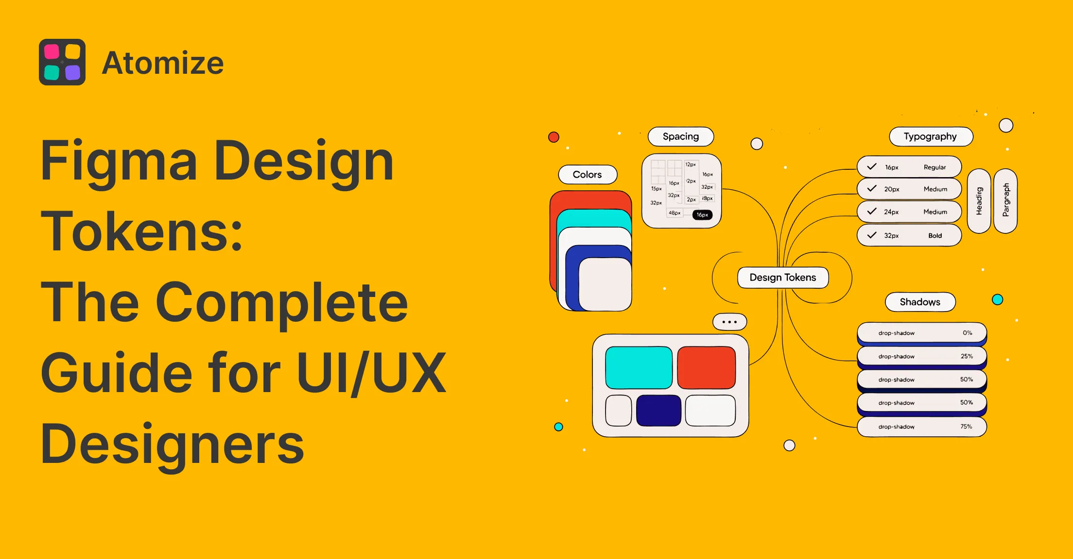
- Figma Design Tokens: The Complete Guide - Variables, primitive/semantic layers, modes, and DTCG
- Coverage Audit vs Untokenized Values - binding score vs literal drift; run before contrast audit on each screen
- Find Untokenized Values in Figma - audit binding before you publish the library
- Figma Plugins for Tokens, Git Sync & Design Workflows - choosing between export, Git sync, and changelog plugins
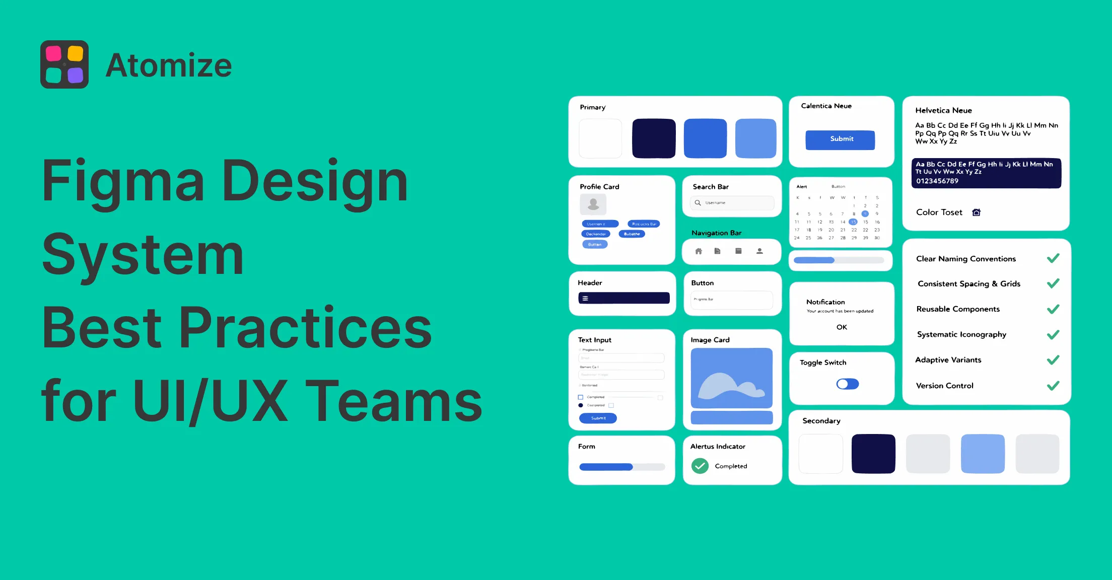
- Figma Design System Best Practices - governance, accessibility, naming, and adoption
Final verdict - Building a Design System in Figma
When you build design system Figma libraries in the right order - audit, tokens, components, governance, code sync - each release compounds value rather than accumulating debt. The two failure modes that undo the work are components built without tokens and a library without a named owner; both are sequencing errors, not technical ones. Start with the minimum viable spine (semantic tokens, five core components, published library, named owner, token export), ship it in two to four weeks, and grow it based on real usage. The system is a product; treat it like one.