A design system in Figma is a maintained team library of design tokens (Variables), reusable components, patterns, and documentation - the single source of truth for visual decisions on a product team. For the product-agnostic definition, start with what a design system is; this guide covers Figma implementation only. It is not the same as a component library (reusable UI without governance) or a style guide (static reference with no code connection). A Figma system adds tokens that reach the codebase, governance for how changes ship, and a named owner who keeps the library current.
Figma design system in one sentence
A Figma design system is a published team library where Variables define tokens, components bind to those tokens, and product files stay linked so updates propagate on republish.
How this guide fits the series
- What is a design system = definition, four layers, when you do not need one (not Figma-specific).
- This page = Figma files, Variables, libraries, governance, and tool limits.
- How to build a design system in Figma = step-by-step build after you decide to start.
- Figma design tokens guide = token layers, modes, export.
The Figma file is the artifact; the system is the process behind it - maintained, versioned, and owned. Without that operating model, published libraries often drift from production within a few sprints. The most common gap: treating a component kit as a full system when tokens, code sync, and release ownership are missing.
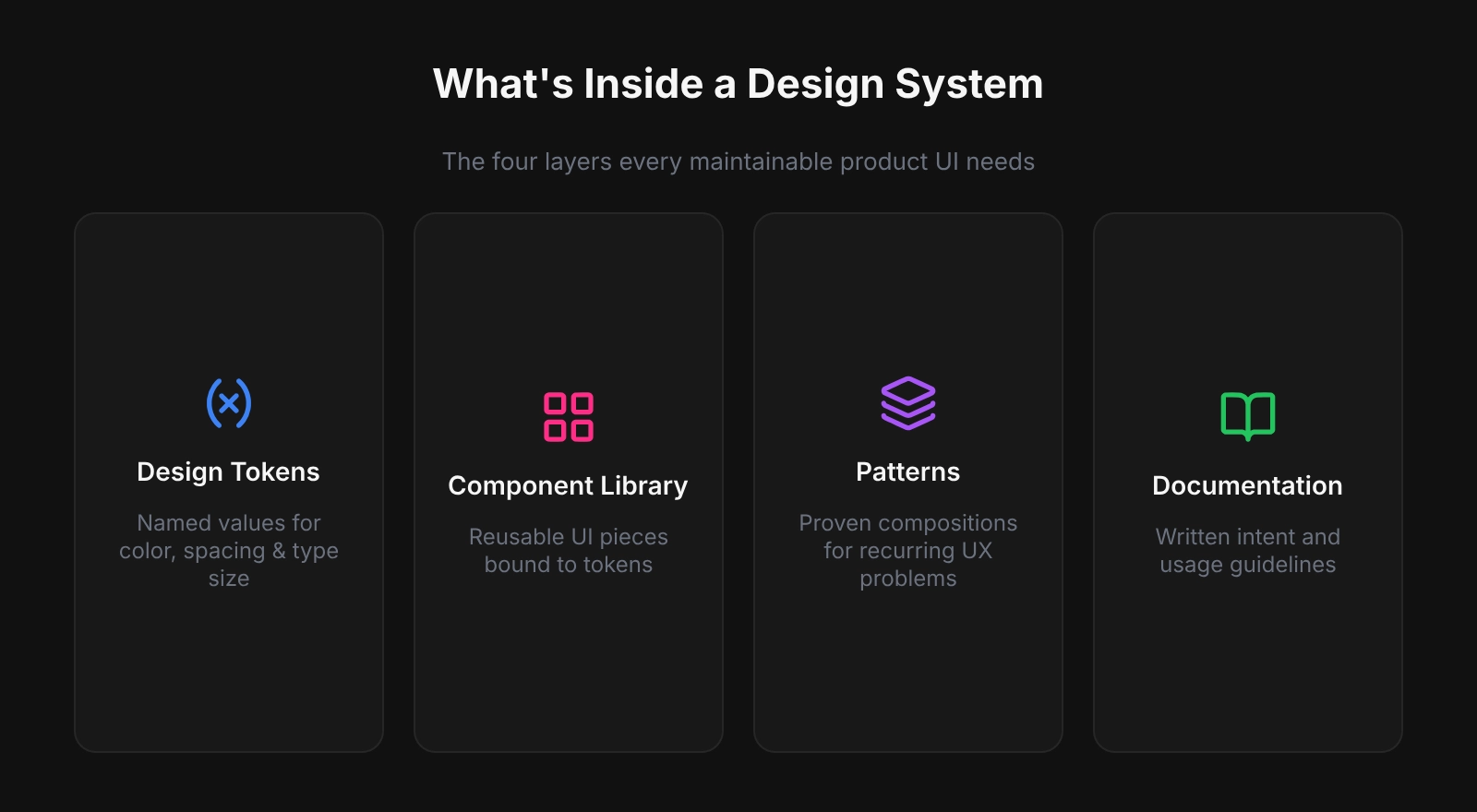
What Goes Into a Figma Design System
Design tokens
Tokens are named decisions for color, type, spacing, radius, shadow, and motion. Without them, components carry hard-coded values that break on dark mode or rebrand. In Figma, tokens live as Variables: primitives (gray/50, blue/500) alias into semantics (background/default, interactive/primary) that map to code such as --color-interactive-primary. Define tokens before components.
Component library
Published components - buttons, inputs, navigation, modals, cards - use auto-layout and token bindings so they resize and theme without manual repaints. Many product teams maintain a focused set of well-documented components that covers most recurring UI; exact count depends on product complexity, not a fixed target.
Patterns and templates
Screen-level compositions: auth flows, data tables, empty states, onboarding. Patterns show how components combine and give developers annotated structure - not isolated widgets.
Documentation
Rationale shipped with the system: primary vs destructive actions, contrast on dark surfaces, spacing per breakpoint. Start with component and variable descriptions in Figma; deeper guidance on a Docs page or Notion. Without docs, misuse grows with team size.
Design System vs Style Guide vs Component Library
A design system adds governance, tokens, and a code pipeline - not just more components. Style guides lack enforcement; libraries without tokens trap hard-coded values. In practice, missing a named owner - not missing components - is the most common reason libraries go stale within a quarter. Treat ownership as a first-class deliverable alongside the Figma file.
Style guide → Component library → Design system. Each step adds more process, more value, and more responsibility to maintain.
| Style guide | Component library | Design system | |
|---|---|---|---|
| Visual reference | Yes | Yes | Yes |
| Reusable components | No | Yes | Yes |
| Design tokens | No | Sometimes | Yes |
| Code connection | None | Optional | Required |
| Governance model | None | Informal | Explicit |
| Who maintains it | Brand / marketing | Design team | Dedicated owner + process |
Real-World Figma Design Systems Worth Studying
- Material Design (Google) - tiered color tokens, motion spec, cross-platform components.
- Atlassian Design System - semantic tokens for light and dark, WCAG AA targets, shared across Jira and related products.
- Shopify Polaris - Figma library and npm tokens with aligned naming (
color.bg.fillin design maps to production CSS variables). - Carbon Design System (IBM) - open source, documented components, tokens as CSS custom properties via Style Dictionary.
- Shared pattern: versioned libraries, documented tokens, explicit design-to-code pipelines.
When to Start Building One
Start when a concrete cost makes the investment unavoidable - rebrand touching many screens, failed accessibility audits from one-off components, or engineers blocked because conventions live only in people’s heads. Many teams formalize tokens and governance once manual consistency work across dozens of components becomes slower than maintaining Variables and a published library. A lean v1 - color and spacing tokens, five core components, published library, named owner - can pay back within the first active sprint. If the product is a small MVP, see when you do not need a design system before over-building in Figma.
Why Figma Is a Strong Home for a Design System
Figma fits designer-led product work: team libraries propagate component updates to linked files, Variables support primitive/semantic tokens with modes (light/dark, compact/default), and auto-layout aligns closely with flexbox-based implementation. Export closes the loop - Tokens Studio, the REST API, or plugins that emit DTCG, CSS, or TypeScript via Style Dictionary - so names and values stay aligned with code.
When Figma Is NOT Enough
Figma is the design source of truth for many teams, but not the only system layer. Plan beyond the canvas when:
- Multi-repo or multi-platform codebases need token sync across several apps - Figma exports once; engineering owns distribution (monorepo packages, CI, Style Dictionary).
- Enterprise governance requires audit trails, role-based publishing, and compliance workflows that exceed a shared library file.
- Code-first systems already define tokens in the repository - Figma becomes documentation or sync target, not the primary authority. See design system parity and design tokens for AI code generation for repo-native workflows.
- Engineering-led UI in the IDE (no dedicated design org) may use repo-native tools; compare Figma vs Pencil for workflow fit.
- Marketing-only or single-campaign work may need only a style guide - not a full Figma system.
First System: Practical Starting Order
- Audit live UI: list hex, type sizes, spacing hacks, repeated components - your debt inventory.
- Create a dedicated library file (not inside a product file); pages: Foundations, Components, Patterns, Docs.
- Define primitive Variables first, then semantic aliases components will reference.
- Build five high-frequency components (button, input, nav shell, card, alert).
- Write descriptions on every component and variable before publishing.
- Publish the team library; default-enable in new project files.
- Name an owner and a lightweight intake process before the contribution backlog grows.
Related Reading
- How to Build a Design System in Figma (Step-by-Step)
- Figma Design Tokens: The Complete Guide
- Design system maturity - score your level after the Figma foundation exists
- Figma Design System Best Practices
Final verdict: design system in Figma
A Figma design system is worth considering at any team size, but scope should match the team - a solo designer on a narrow MVP needs tokens plus a small library, not a full governance program. Tokens remove the costliest manual work (repaints, rebrands, dark-mode retrofits); five strong components often cover most new screens early on. Teams that publish token-backed libraries with owners commonly report smoother handoff, though timelines vary. Start with tokens, ship five components, publish, assign ownership, then grow with the product.