
This design system definition covers a maintained set of tokens, components, patterns, and documentation that gives product teams a single source of truth for building consistent UI at scale. The concept is formalized further in the Wikipedia article on design systems, which traces the evolution from style guides to governed, cross-discipline platforms. This article answers the foundational question - what it is, how the layers stack, when it fails, and when you do not need one.
Related workflows: what a design system is in Figma (Figma Variables and libraries), design system maturity (five levels and scorecard), and how to build a design system in Figma (step-by-step build).
Design system in one sentence
A design system is shared, versioned rules for how your product looks and behaves - expressed as named tokens, reusable components, proven patterns, and documentation that design and engineering both use.
How this article fits the series
- This page = definition, four layers, failure modes, when to skip or start.
- What is a design system in Figma = Figma files, Variables, libraries (not a repeat of this intro).
- Design system maturity = assess level 1-5 and score your team.
- How to build a design system in Figma = implementation checklist after you decide to build.
A design system is a set of standards to manage design at scale by reducing redundancy while creating a shared language and visual consistency across pages and channels. - Nielsen Norman Group
What a Design System Actually Is
A design system is not a Figma file, an npm package, or a Storybook instance - it is the agreement those artifacts represent: maintained, versioned, owned decisions that connect visual choices to production code. The Wikipedia entry on design systems traces the evolution from static style guides to governed, cross-discipline platforms. The Nielsen Norman Group defines it as standards for managing design at scale with reusable components and patterns. In practice, the most common gap is treating a component kit as a system - no token layer, no release process, no owner. A design system needs all three.
The word maintained is load-bearing. A collection of Figma components nobody updates is a snapshot, not a system. You need an owner, a release process, and a way to keep design values and code values aligned - or drift returns within months.
The Four Layers
Every mature design system stacks four layers. Each layer depends on the one below. Without tokens, rebrands and new themes become manual repaints across hundreds of components.
Tokens
  ↓
Components
  ↓
Patterns
  ↓
Documentation
Many Figma files labeled “design system” are static kits: styles instead of Variables, no collection structure, no path to code. Teams notice when the first rebrand requires editing hex values file by file.
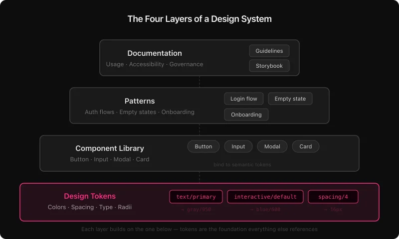
Design tokens
Tokens are named visual decisions: color, spacing, type, radius, shadow, and motion as values with names - not one-off hex codes. The W3C Design Tokens Community Group standardizes a portable JSON format. In Figma, tokens live as Variables; in code they become CSS custom properties or TypeScript constants with matching names.
Strong systems use primitives (gray/50, blue/600) and semantics (text/primary, interactive/default). Components bind to semantics so dark mode is a mode switch, not a repaint job. Details: Figma design tokens guide.
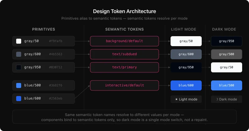
/* Primitives - raw values, no product meaning */
gray/50    →  #f9fafb
gray/950   →  #030712
blue/600   →  #2563eb
red/600    →  #dc2626

/* Semantic - Light mode */
background/default       →  gray/50
text/primary             →  gray/950
text/subdued             →  gray/600
interactive/default      →  blue/600
interactive/destructive  →  red/600

/* Semantic - Dark mode (same names, different aliases) */
background/default       →  gray/950
text/primary             →  gray/50
interactive/default      →  blue/500
Component library
Components are reusable, documented UI pieces - buttons, inputs, navigation, modals, tables. System components bind to tokens, document variants and states, and update from a master. A focused set of well-maintained components often covers most product UI. Build steps: how to build a design system in Figma.
Patterns
Patterns sit above components: authentication flows, empty states, onboarding, filtered tables. A pattern is a proven composition plus rationale - not a single widget.
Documentation
Documentation explains intent - when to use primary vs destructive actions, which text styles meet WCAG contrast on dark surfaces, spacing at breakpoints. It lives in component descriptions, variable annotations, and deeper docs pages. Without it, misuse grows with team size.
Design System vs Component Library vs Style Guide
These terms mark three levels of maturity - not synonyms. Teams often label a kit a “design system” and are surprised when it does not scale without tokens, code connection, and governance. Identify your actual level before choosing what to build next; use design system maturity for a scored assessment.
Design system maturity compared
| Style guide | Component library | Design system | |
|---|---|---|---|
| Visual reference | Yes | Yes | Yes |
| Reusable components | No | Yes | Yes |
| Design tokens | No | Rarely | Yes |
| Code connection | None | Optional | Required |
| Theming / dark mode | No | Manual | Automatic via tokens |
| Governance model | None | Informal | Named owner + process |
| Scales with team | No | Partially | Yes |
A style guide documents decisions. A component library packages them. A design system connects them to production code and gives them a process for staying current.
Why Design Systems Fail
Most failures are governance failures, not tooling failures. Teams add tokens, publish Storybook, and still drift because nobody owns releases and docs go stale. The recurring pattern: a library with hard-coded hex, no maintainer, abandoned after v1. Fix: named owner, tokens connected to code, treat the system as a product with a release cadence.
- Components built without tokens - rebrands and themes require manual repaints.
- No named owner or dedicated system designer - libraries drift within months.
- Documentation written once - workarounds multiply; teams stop trusting the system.
- Tokens never reach code - engineering keeps a parallel set; drift is certain.
- Oversized v1 - six-month launches get abandoned; lean four-week releases get used.
Healthy systems share token-first foundations, shared naming across Figma and code, an export pipeline, and adoption work - not publish-and-hope. See design system best practices.
Design system quality: thriving vs decaying
| Dimension | Thriving system | Decaying system |
|---|---|---|
| Token structure | Primitive + semantic layers, code-synced | Flat hex or styles without aliasing |
| Naming | Shared dictionary in design and code | Design-only names that diverge |
| Code sync | Export pipeline; token PRs reviewed | Manual copy-paste; parallel values in code |
| Docs | Updated on publish | Wiki stale after launch |
| Governance | Named owner, intake process | Ad hoc requests; no accountability |
| Maintenance | Audits and deprecations | Stale components never removed |
Real-World Design System Examples
Material, Polaris, Carbon, and Atlassian share structural choices that explain why they scale: tokens as a first-class layer, Figma libraries and code packages under one naming scheme, explicit pipelines from design to production. Use them as reference architectures.
- Google Material Design - tonal color system, motion spec, cross-platform components.
- Shopify Polaris - tokens, Figma library, npm package with aligned names.
- Carbon Design System (IBM) - open source, CSS custom properties, Style Dictionary; primitive vs semantic tiers such as
$gray-10and$layer-01. - Atlassian Design System - semantic tokens for light and dark, WCAG AA targets, shared across Jira, Confluence, and related products.
In all four, token structures are documented and versioned, libraries are owned, and design-to-code paths are explicit.
When you do NOT need a design system
A full system is overhead you can skip when UI surface area is small, conventions are stable, or the team will not maintain it. Common cases:
- Single product with one designer and fewer than ~10 recurring screens - a tight component kit may be enough.
- Pre-PMF MVP where UX changes weekly - process cost exceeds consistency benefit.
- One-off marketing site or campaign with a fixed PDF or slide brand - no ongoing product UI.
- Agency delivery with handoff to a client who owns no system - document the file, do not build org-wide governance.
- Team under three people with no plan to hire design or front-end scale - start with tokens + five components only if you will maintain them.
- Internal tools with admin-only users and low brand risk - consistency matters less than speed until usage grows.
Skipping a system is valid; pretending a static kit is a system is not. If you later hit rebrand, second product, or audit failure, revisit the build triggers in the next section.
When to Build One
Build when a measurable cost forces the decision - not because it feels mature. Rebrand touching hundreds of screens, failed accessibility audits from one-off colors, or a second product that already drifted from the first are typical triggers.
- Rebrand requires touching 300+ screens by hand
- Accessibility audit fails on hard-coded one-off components
- New engineers cannot ship for weeks because conventions live only in people’s heads
- Second product must match the first but already looks different
- You are ready to fund an owner and a release cadence, not just a Figma file
A lean v1: color and spacing tokens, five core components (button, input, nav shell, card, alert), published library, named owner. Grow from that spine. Token depth: Figma design tokens guide. Export options include Tokens Studio, Style Dictionary, or Figma plugins that emit DTCG, CSS, or TypeScript.
If you later adopt AI coding assistants, tokens and docs become even more important - that workflow is covered in design tokens for AI code generation, not here, so this page stays focused on the core definition.
Related Reading
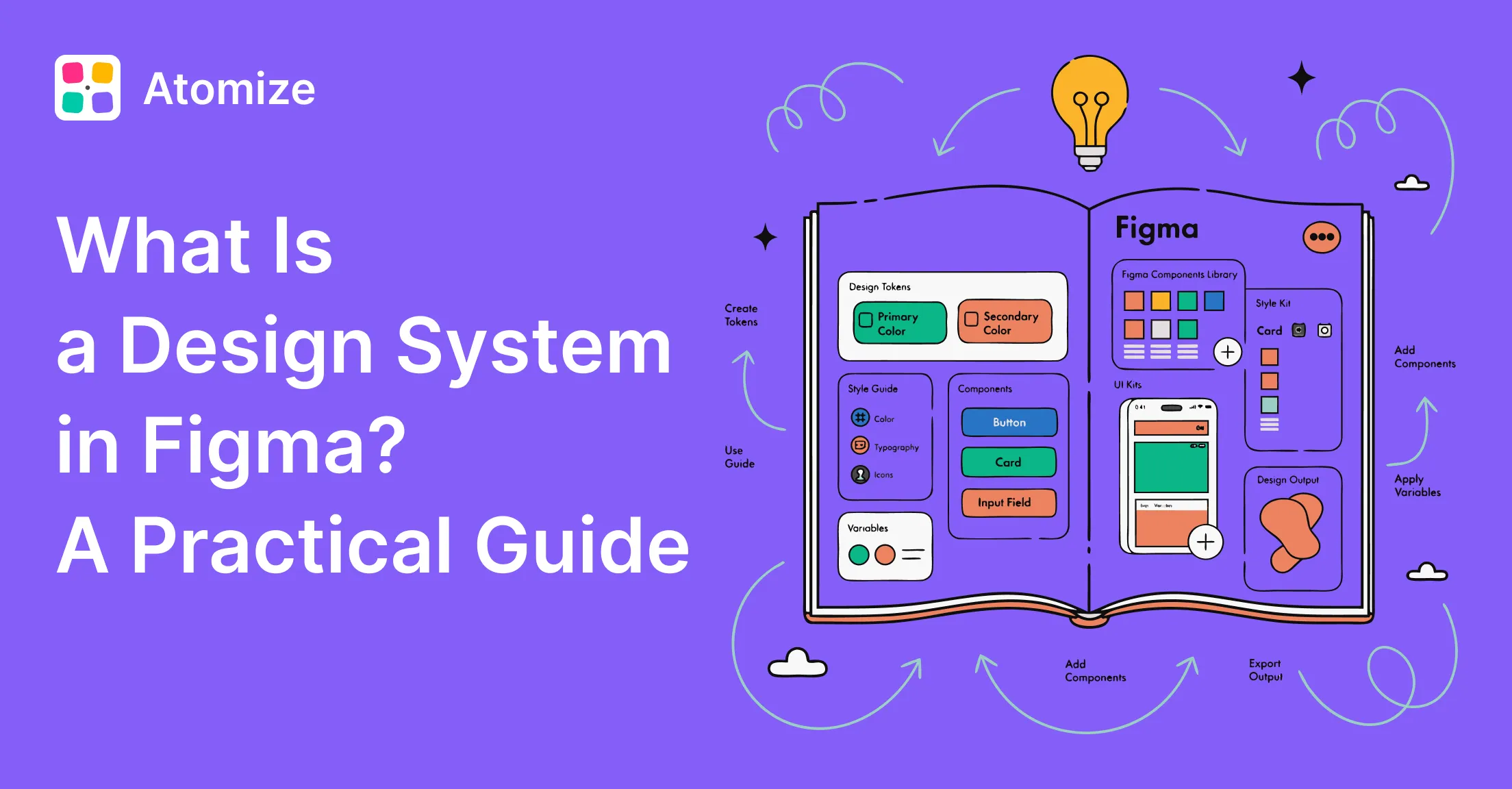
- What Is a Design System in Figma? - Figma Variables, libraries, and file structure for design systems
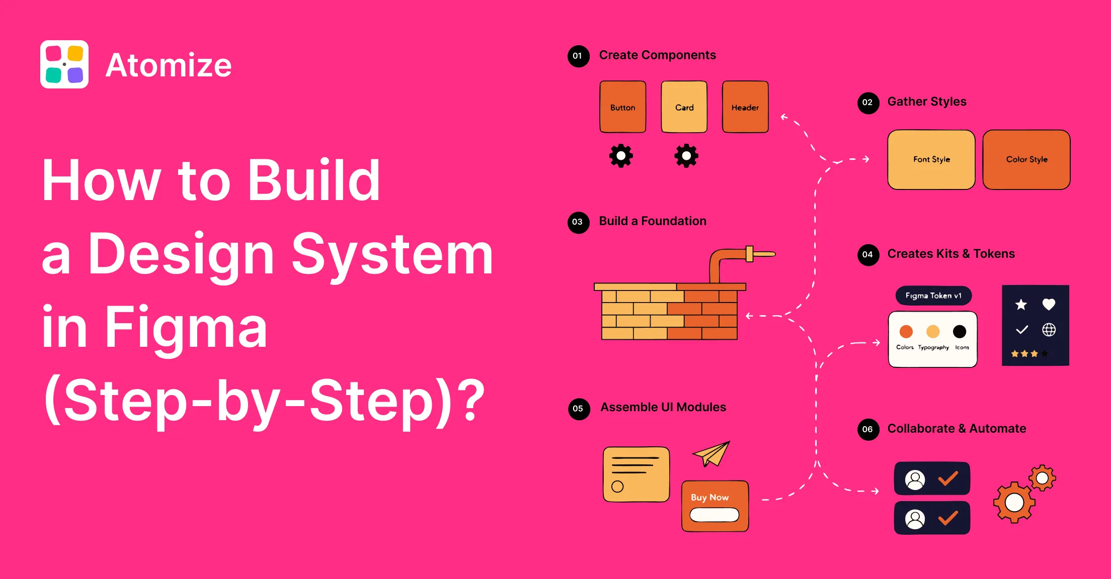
- How to Build a Design System in Figma - a practical guide on how to create a design system, from library setup to launch
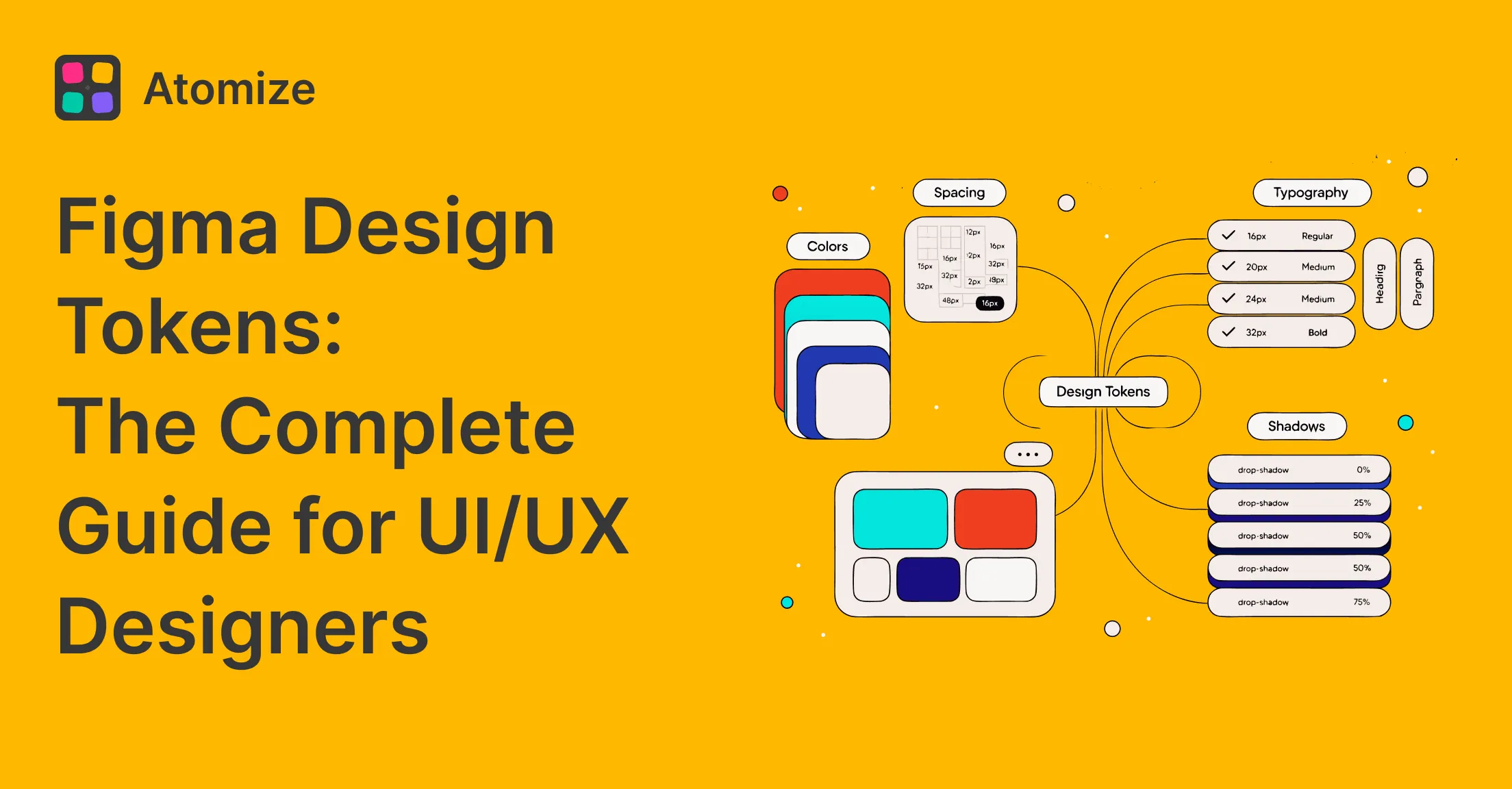
- Figma Design Tokens: The Complete Guide - Variables, primitive/semantic layers, modes, and DTCG export
- Design System Maturity: 5 Levels Explained - score your level and prioritize the next step
- Figma Design System Best Practices - governance, naming, accessibility, and code sync habits
Final verdict: design systems
A design system is infrastructure, not a one-time deliverable. It pays off when tokens connect to code, a named owner maintains components, and the team treats it as a product. Start with tokens, publish a lean library, wire the export pipeline, assign an owner - then patterns, docs, and maturity work compound. Measure progress with the maturity scorecard when you are ready to go beyond definitions.