What Is a Design System in Figma? A Practical Guide
What a Figma design system is, what it contains, how it differs from a component library, and when your team needs one.
A design system in Figma is a maintained team library of design tokens (Variables), reusable components, usage patterns, and documentation — the single source of truth for every visual decision on a product team. It replaces ad-hoc choices with named values and tested patterns: a color change updates everywhere, a theme switch applies in one step, and a new designer can ship independently without weeks of tribal knowledge transfer. Unlike a component library (reusable UI pieces without a governing structure) or a style guide (static reference with no code connection), a design system includes the operating model — tokens that reach the codebase, governance over how changes ship, and a named owner who keeps it current.
What Is a Design System?
A design system is the shared agreement that keeps every product decision — tokens, components, patterns, documentation — in one maintained place. Without that agreement, libraries drift: individual screens accumulate one-off colors and components that no published file governs, making a rebrand or accessibility pass exponentially more expensive. In Figma the agreement manifests as a published team library that product files link to, so component updates propagate automatically on republish. The takeaway: the Figma file is the artifact; the system is the process and ownership model behind it.
The key distinction: a design system is not the Figma file. It is the agreement the file represents — maintained, versioned, and owned by someone. Without that operating model, any library decays into outdated components that teams quietly stop using.
The most common misconception we encountered building Atomize was teams conflating a published Figma component library with a design system. A component kit and a design system are related but distinct: the kit is the output, the system is the infrastructure that produces, governs, and maintains it. Teams that published a well-structured Figma file without tokens connected to code, without a named owner, and without a release process typically found their library drifting out of sync with production within two to three sprints.
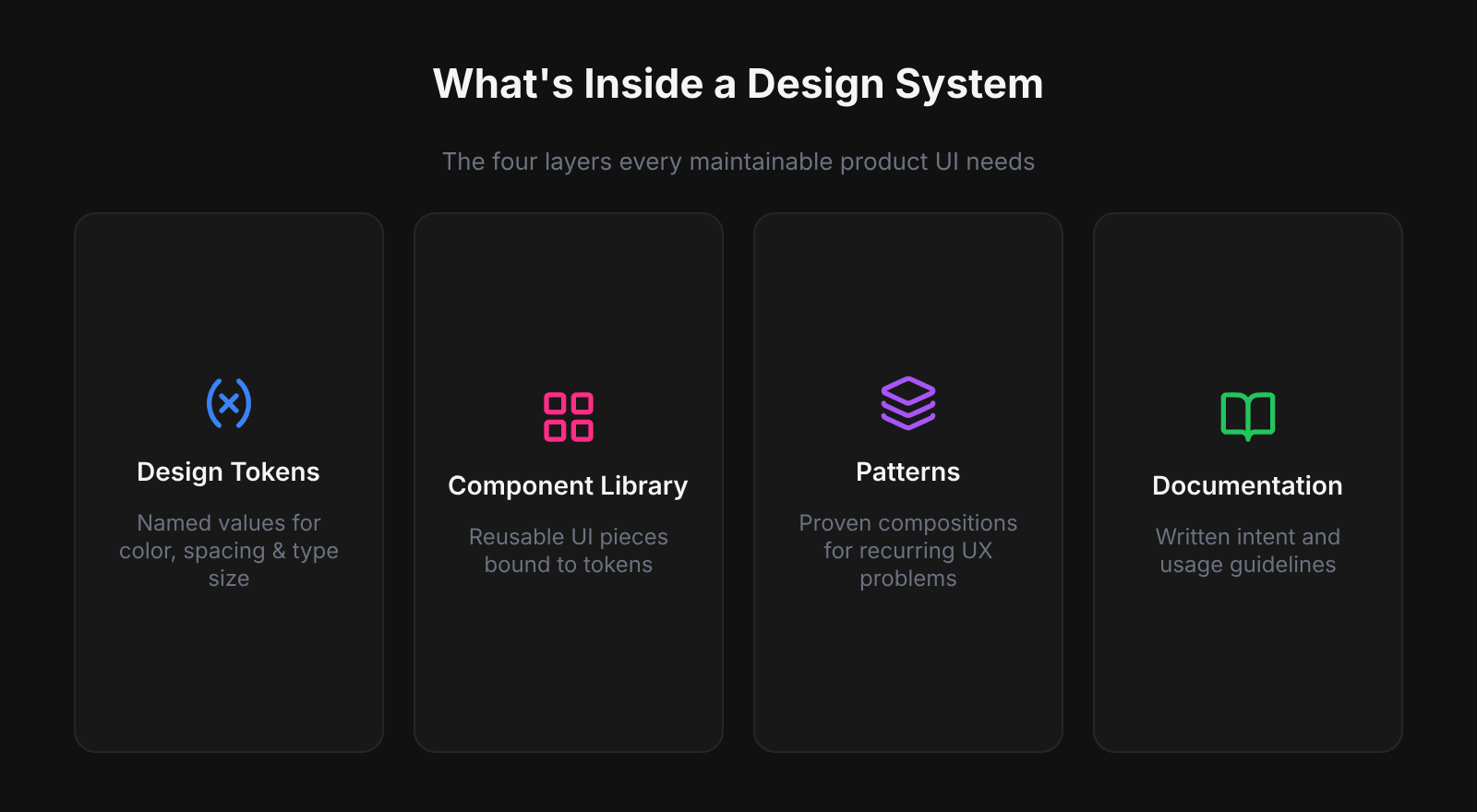
What Goes Into a Figma Design System
Design tokens
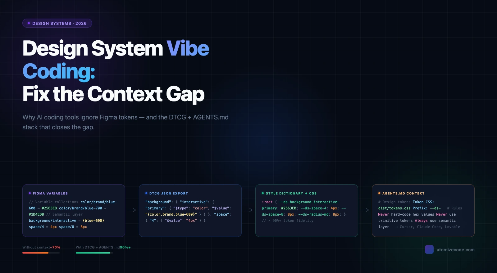
Tokens are the foundation of a Figma design system — named decisions for every color, type size, spacing step, border radius, shadow, and motion duration. Without them, components carry hard-coded values that shatter the moment you add dark mode or a second brand. In Figma, tokens live as Variables in two layers: primitives (gray/50, blue/500) alias into semantics (background/default, interactive/primary), and those semantics become the contract with code — --color-interactive-primary in CSS resolves to the same primitive as the Figma Variable. Define tokens before components so every layer above inherits the update path.
Component library
Published components — buttons, inputs, navigation, modals, feedback banners, cards — built with auto-layout and bound to tokens so they resize correctly and theme without manual re-painting. A focused library of 40- 60 well-built, documented components typically covers 80- 90 % of UI decisions for a mid-size product.
Patterns and templates
Reusable compositions at the screen level: authentication flows, data tables, empty states, onboarding sequences. Patterns show how components work together in context and give developers annotated, realistic structure to implement — not just isolated widgets.
Documentation
Written rationale that ships with the system: when to use a primary vs. destructive action, which text styles pass contrast on dark backgrounds, how much padding a card needs at each breakpoint. In Figma this starts with component and variable descriptions. Deeper guidance lives on a dedicated Docs page or in Notion. Without docs, components get misused at a rate proportional to team size.
Design System vs Style Guide vs Component Library
A design system is not a bigger component library — it is a different category of artifact that adds governance, tokens, and a code pipeline to what a library already does. Style guides break down at scale because they carry no enforcement mechanism; component libraries break down without tokens because every hard-coded value becomes a manual update. Working with teams across Atomize, we found that the absence of a named owner — not missing components — was the single most common reason libraries went stale within a quarter. Treat the ownership model as a first-class deliverable alongside the Figma file.
Style guide → Component library → Design system. Each step adds more process, more value, and more responsibility to maintain.
| Style guide | Component library | Design system | |
|---|---|---|---|
| Visual reference | Yes | Yes | Yes |
| Reusable components | No | Yes | Yes |
| Design tokens | No | Sometimes | Yes |
| Code connection | None | Optional | Required |
| Governance model | None | Informal | Explicit |
| Who maintains it | Brand / marketing | Design team | Dedicated owner + process |
Real-World Figma Design Systems Worth Studying
- Material Design (Google) — tiered color tokens (baseline, key color, tonal palette), Motion spec, shared across Android, iOS, and web.
- Atlassian Design System — semantic token layers for Light and Dark, WCAG AA by default, shared across Jira, Confluence, Bitbucket, and Trello.
- Shopify Polaris — design tokens, Figma library, and a polaris-tokens npm package where names mirror the Figma Variable paths exactly:
color.bg.fillin Figma is--p-color-bg-fillin production CSS. That one-to-one naming convention is what Atomize enforces with thecategory/role/variantpath structure — it eliminates the translation step where token drift typically starts. - Carbon Design System (IBM) — open-source, ~40 stable components, all tokens exposed as CSS custom properties and Style Dictionary outputs.
- Pattern across all four: documented token structures, versioned component libraries, explicit pipelines that carry design values into production code.
When to Start Building One
Start building a design system when a concrete cost makes the investment unavoidable — not when the idea feels right. The most common triggers are a rebrand that requires touching hundreds of screens by hand, an accessibility audit that fails because every component is a one-off, or a new hire who cannot ship independently for two weeks. Teams using Atomize typically reached this threshold around the 30–50 component mark, when the overhead of keeping components consistent manually exceeded the time to formalize tokens and governance. A lean first version — color and spacing tokens, five core components, a published library, a named owner — starts paying off within the first sprint of active use.
Why Figma Is the Right Home for a Design System
Figma is the right home for a design system because its architecture mirrors how design systems actually work — shared, versioned, and connected across files. Other tools store components in isolation; Figma's team library model propagates updates to every linked product file automatically. Variables support the full primitive/semantic token model with native modes (Light/Dark, Compact/Default) that switch at frame level, and auto-layout mirrors CSS flexbox closely enough that developer handoff reflects production layout rather than a static snapshot. Plugins like Atomize close the final gap by exporting Variables as JSON, CSS custom properties, or TypeScript — same values, same names, same source.
First System: Practical Starting Order
- Audit your live UI: list every hex, type size, spacing hack, and repeated component — your debt inventory and build priority.
- Create a dedicated library file (never inside a product file); organize pages as Foundations, Components, Patterns, Docs.
- Define primitives first (color palette, spacing scale, type scale as Variables), then create semantic aliases components will reference.
- Build the five highest-frequency components (button, input, navigation shell, card, feedback/alert).
- Write descriptions on every component and variable before publishing — intent that ships with the asset beats a separate wiki.
- Publish the team library and default-enable it in new project files.
- Name an owner and define a lightweight intake process before the contribution backlog becomes unmanageable.
Related Reading
- How to Build a Design System in Figma (Step-by-Step) - audit, token layers, components, publish, and code sync
- Figma Design Tokens: The Complete Guide - Variables, primitive/semantic layers, modes, and export
- Figma Design System Best Practices - governance, naming conventions, accessibility, and adoption
Final verdict - Design System in Figma
A Figma design system is worth building at any team size — the question is not whether, but how lean to start. Most teams underestimate how quickly a minimal system pays back: tokens eliminate the most expensive manual work (repaints, rebrand passes, dark-mode retrofits), and five well-built components cover the majority of UI decisions. At Atomize we've seen teams reduce design-to-handoff revision cycles by half within two months of publishing a token-backed library with a named owner. Start with tokens, build the five highest-frequency components, publish the library, and assign ownership — then grow the system at the pace the product demands.
A maintained team library containing design tokens (Variables), reusable components, patterns, and documentation that keeps every product screen consistent and speeds up building new ones.
No. A component library is part of a design system. The full system also includes design tokens, usage documentation, accessibility standards, a governance model, and a token export pipeline so the same values live in code.
Yes, but scaled down. Two token collections, five components, and a published library pays off quickly — especially if you hand off to developers or expect the product to grow.
Always tokens first. Components built without Variables inherit hard-coded values that break the moment you add dark mode, a second brand, or a density option.
A Figma Professional or Organization plan is required to publish shared team libraries. The free Starter plan allows draft sharing, but cross-file component linking requires a paid plan.