How to Create Dark Mode in Figma with Variables
How to build light and dark mode in Figma with Variables and Modes - two-collection architecture, semantic aliases, CSS export, and theme switching.
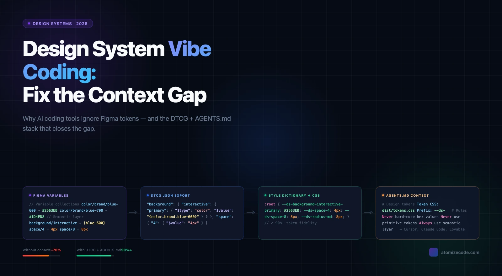
Dark mode in Figma works by binding component fills to semantic Variables that resolve to different color values per Mode — switch the Mode on any frame and every bound component updates instantly, with no manual fill swapping. The reliable way to build this is a two-collection architecture: a Primitives collection for raw color values and a Semantic collection with Light and Dark modes that alias those Primitives. This article covers that setup end-to-end: collection structure, naming conventions, CSS export, and browser-side theme switching.
What are Figma Variables?
Figma Variables are the foundation of any scalable theming system because they support Modes — parallel value sets that can be switched per frame without touching a single component. Unlike Styles, which hold one fixed value, a Variable can resolve to a completely different color depending on which Mode is active. This distinction matters the moment you need to ship dark mode: without Modes, every theme change is a manual operation that drifts out of sync as the design evolves. If Figma Variables are new to you, the complete Figma design tokens guide covers the foundations before you continue here.
How to create dark mode in Figma
The recommended approach uses two Variable collections — Primitives and Semantic — and the full setup takes about 20 minutes from scratch. Most teams skip the two-collection structure on their first attempt and put everything in one collection, which works until they try to add a brand theme or high-contrast mode and find the system impossible to maintain. In Atomize, every new file we onboard uses this exact two-collection pattern because it is the only structure that scales cleanly to additional modes later. Here is the complete process at a glance:
- Create a Primitives collection in the Variables panel. Add all raw color values (every palette step) with no modes.
- Create a Semantic collection. Add two modes: Light and Dark.
- For each semantic token, alias the Light mode value to a Primitive and the Dark mode value to a different Primitive.
- Bind all component fills, strokes, and effects to semantic tokens only - never to Primitives directly.
- Switch modes on any top-level frame to instantly preview the dark theme across every component.
- Export the Semantic collection as CSS custom properties for use in your codebase.
The sections below cover each step in full detail, including naming patterns, exact Figma UI steps, CSS output, and browser-side activation. For how this fits into a production-ready scalable design system, see the guide on how to build a design system in Figma.
Best setup: use one Primitives collection for raw color values and one Semantic collection with Light and Dark modes. Bind components only to semantic tokens. This keeps the design system themeable across modes and prevents hardcoded color drift between Figma and code.
Why Variables beat manual overrides for dark mode
Variables beat manual overrides for dark mode because they make theming a structural property of the design file, not a maintenance task. Before Variables, the realistic options were duplicating frames for each theme, using boolean component properties to toggle dark states, or leaving dark mode entirely to engineering — all approaches that break down as the design system grows. Theming at scale requires the same value change to propagate to every component simultaneously, which is only possible when fills are bound to tokens rather than hardcoded. Following design system best practices means treating theming as a first-class concern in your token architecture — Figma Variables handle it at the structural level so nothing needs to be tracked by hand.
The most common support message we received in Atomize's early months was some version of: 'I switched modes and half my components didn't update.' In every case we investigated, the root cause was the same - fills on those components were bound to a Primitive variable rather than a Semantic token. Primitives have no modes, so switching modes has no effect on them. It is an easy mistake to make when building quickly, and it is invisible in light mode where both Primitives and Semantics resolve to the same value.
Manual overrides vs Variables + Modes
| Manual overrides | Variables + Modes | |
|---|---|---|
| Maintenance | High - each frame is independent | Low - change token, every component updates |
| Handoff | Two frame sets to annotate | One component, mode selector in Dev Mode |
| Component scope | Breaks when variants change | Stable - token references survive refactoring |
| Code sync | No direct connection | Tokens export to CSS custom properties |
The two-collection architecture
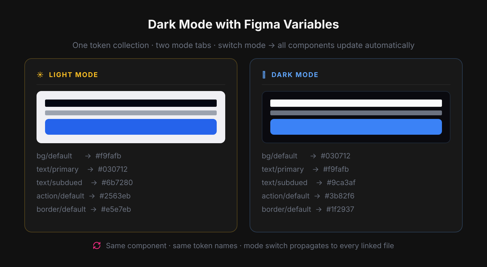
The two-collection architecture is the correct structure for any production dark mode system because it separates what a color is from what it means in the UI. Primitives hold raw values — every palette step, no modes — while the Semantic collection describes intent: background/page, text/primary, interactive/default. When dark mode activates, only the semantic aliases change; the Primitives and every component remain untouched. This is the same pattern used by Material Design, IBM Carbon, and Shopify Polaris — build it this way once and adding further themes never requires restructuring.
This two-layer separation is what makes dark mode work without touching components. When dark mode needs a different background, only the semantic alias changes - the Primitive stays the same and the component never needs to know. If a component's fill references a Primitive directly, it cannot respond to mode changes; this is the most common dark mode bug in Figma-to-code workflows. The design tokens guide explains the primitive vs semantic distinction if you need more depth.
The example below shows a full token architecture for a two-mode light/dark system:
Setting up collections in Figma
Setting up two collections in Figma correctly from the start prevents the most common dark mode bugs before they occur. Many teams create a single collection with Light and Dark modes and skip the Primitives layer, which works initially but makes it impossible to reference raw values across multiple Semantic collections or export clean tokens for engineering. In Atomize's onboarding flow, we create the Primitives collection first and lock its scope before touching Semantics — this order matters because aliases must point to existing variables. Follow these steps to build the full two-collection structure:
- Open the Variables panel in the right sidebar (⌥V on Mac, or click the Variables icon in the toolbar). Create a collection named Primitives. Add Color variables for every palette step you need. No modes are required here.
- Create a second collection named Semantic. Click the + icon next to the mode tab inside this collection to add a second mode. Name them Light and Dark.
- For each semantic token, click the value field in the Light mode column and use the cube icon - not the color picker - to alias it to a Primitive variable. Repeat for the Dark mode column with a different Primitive alias.
- Group variables using a slash as a path separator. Type
background/pageas the variable name and Figma creates a background folder automatically. Use consistent group names across the token architecture: background/*, text/*, border/*, interactive/*, status/*. - Set Variable Scopes on semantic tokens to control where they appear.
background/pageshould scope to Frame Fill and Shape Fill only.text/primaryshould scope to Text Fill only. This prevents applying the wrong token in the wrong context. - Publish both collections via the Assets panel. Every component file in the organization can reference these tokens through the shared library.
Naming semantic tokens for dark mode
Semantic token names must describe the role of a value in the UI, not its visual appearance — this is the rule that keeps the naming system honest across all themes. A color-based name like background-white becomes a lie the moment dark mode assigns a near-black value, and that lie propagates into CSS variable names, design annotations, and cross-team handoff. The W3C Design Tokens Community Group formalizes role-based naming in its specification precisely because value-based names break at the first theme boundary. Name every semantic token for what it does, and the system remains readable regardless of how many modes you add.
Semantic token naming - role-based vs value-based
| Token name | Type | Reason |
|---|---|---|
interactive/default | Good | Role-based, accurate in both modes |
blue-600 | Poor | Value-based, misleading in dark mode |
background/surface | Good | Describes UI layer, not the color behind it |
card-white | Poor | Breaks entirely when dark mode assigns a dark value |
border/default | Good | Describes function, not the gray value it references |
gray-200-border | Poor | Locks the name to light mode's value |
text/on-accent | Good | Describes context (text placed on a colored element) |
text-white-on-button | Poor | Redundant and breaks if button background changes |
Exporting dark mode tokens to CSS
Exporting dark mode tokens to CSS is the step that closes the gap between what Figma shows and what the browser renders — get it wrong and tokens drift between the design file and the codebase within days. Engineering teams need CSS custom properties that mirror the exact Semantic collection structure in Figma, with Light values as :root defaults and Dark values as scoped overrides. Tokens Studio reads Variables directly from Figma and outputs DTCG-compliant JSON that Style Dictionary transforms into CSS, SCSS, or TypeScript; the Figma Variables REST API provides the same data without a plugin if you prefer a custom pipeline. See the Figma plugins guide for a comparison of export tools.
The CSS output maps each semantic Variable to a custom property. Light mode values become the default :root declarations; dark mode values override them under a [data-theme="dark"] selector:
Components reference CSS variables throughout the stylesheet - no hardcoded hex values anywhere. That single binding is what allows an entire UI to respond to a theme switch with one attribute change on the root element. Achieving reliable design system parity between Figma and code depends on this kind of single source of truth at the token level. If you want to automate the Variables setup and token export workflow in Figma — creating Primitive and Semantic collections, scanning for unbound fills, and syncing token changes to your codebase — Atomize handles that directly inside Figma without leaving the design tool.
Theme switching in the browser
Browser-side theme switching is where the Figma token architecture pays off — a single attribute change on the document root triggers every CSS custom property override simultaneously. Two patterns cover the vast majority of production use cases: prefers-color-scheme, which reads the OS setting automatically without JavaScript, and the data-theme attribute, which lets users override that preference with a manual toggle persisted in localStorage. Most apps that ship a theme switch combine both: default to OS preference, then allow the user to override it. Choosing the right pattern for your product determines how much JavaScript you need and how much control users expect.
prefers-color-scheme vs data-theme attribute
| prefers-color-scheme | data-theme attribute | |
|---|---|---|
| Control | OS-driven, automatic | App-driven, manual |
| JavaScript needed | No | Yes (toggle + persistence) |
| User override | Not possible | Supported via toggle |
| Best for | Static sites, simple apps | Apps with a theme toggle UI |
| Figma equivalent | Mode set to match OS setting | Mode switched manually in file |
The prefers-color-scheme MDN reference covers browser support in detail. One important accessibility note: WCAG 2.1 contrast requirements apply independently to each mode. A dark theme that passes contrast requirements does not inherit the light theme's passing status - both must be validated separately.
Extending to more modes
The two-collection architecture extends cleanly to any number of themes because the Semantic layer is the only thing that changes when a new mode is added. Adding high-contrast accessibility support means one new mode column in the Semantic collection; adding a white-label brand variant means one more column per brand. The practical limit is not Figma's — it supports up to 40 modes per collection — but the cognitive overhead of managing too many combinations in one place. Keep each concern in its own Semantic collection: Light/Dark in one, Brand A/Brand B in another, and stack them using Tokens Studio's token set layering or Style Dictionary's multi-source transform pipeline for cross-platform theming at scale.
One failure mode worth naming explicitly: when teams combine a Color theme axis (Light/Dark) and a Density axis (Compact/Default) inside the same Semantic collection, Figma creates four mode combinations — Light+Compact, Light+Default, Dark+Compact, Dark+Default. The canvas handles this correctly, but CSS export produces four separate selector blocks that are difficult to override independently in production. Every Atomize user who hit this pattern eventually split Color and Density into separate collections and layered them at export time. It is a one-time restructure that prevents ongoing CSS maintenance pain.
Troubleshooting dark mode variables in Figma
Why doesn't my component change when I switch modes?
The most likely cause is that the component's fill references a Primitive variable directly instead of a Semantic token. Primitives have no modes, so switching modes has no effect on them. Open the problematic layer in the Variables panel, find the fill that is not changing, and re-bind it to the corresponding Semantic token. For large component libraries with dozens of components, Atomize can scan the entire Figma file and flag all layers that reference Primitives directly — faster than auditing each component manually.
Why are dark mode colors not updating in component instances?
Instance overrides in Figma can block mode changes from propagating. If a fill was manually overridden on a specific instance, that override takes precedence over the mode switch. Right-click the instance and select Reset all overrides, then try switching modes again. Going forward, avoid overriding fills on instances - use token aliases instead.
Why do Primitive tokens not switch between Light and Dark?
Primitives are constants by design - they should not have modes, and switching modes should not affect them. If you expect a Primitive to change with the theme, the underlying issue is that the Semantic layer is missing. Create a Semantic token that aliases the correct Primitive per mode, then bind components to the Semantic token rather than the Primitive.
Common dark mode mistakes in Figma
- Binding components directly to Primitive variables. If a button fill references
blue/600instead ofinteractive/default, that fill cannot respond to mode changes without a manual override. - Using value-based names as semantic names. A token named
background-whiteorgray-200-borderis misleading in dark mode and produces confusing CSS variable names in the codebase. - Mixing concerns in one collection. Combining light/dark with brand variants and density modes in a single collection creates a mode matrix that grows unmanageable quickly. Keep each dimension in its own collection.
- Skipping Variable Scopes. Without scoping,
background/pageappears in text fill dropdowns andtext/primaryappears in fill pickers for shapes. Scopes restrict each token to the property types where it belongs. - Publishing without mode-testing components. Before publishing a library update, switch the active mode on a high-level frame and visually review all component states for both themes.
- Hardcoding hex values anywhere in the design. Any fill, stroke, or effect that bypasses the token system will not respond to mode changes and creates immediate drift between the Figma file and the codebase.
Final verdict - Dark Mode in Figma
The two-collection architecture — Primitives with no modes, Semantics with Light and Dark modes — is the cleanest, most maintainable way to build dark mode in Figma. Components bind to semantic tokens only; switching themes becomes a single attribute change in both Figma and the browser. Set it up correctly once and it scales to additional themes, brands, and platforms without a rebuild. If components are not responding to mode switches, the fix is almost always re-binding fills to semantic tokens rather than adding more complexity.
Figma Variables store color values in named slots. When a Variable collection has multiple Modes, each slot can hold a different value per mode. For dark mode, you create a Semantic collection with two modes - Light and Dark - and alias each token to a different raw color from your Primitives collection. Components bound to semantic tokens switch values automatically when the mode changes. No component edits are needed.
Design tokens are the concept - named, platform-agnostic values for UI decisions. Figma Variables are Figma's implementation of that concept. In practice, your Figma Variables are your design tokens. The term 'token' is used broadly across design systems and standards like the W3C DTCG spec; 'Variable' is Figma's product name for the same idea.
Technically yes, but it is not recommended. Using a single collection mixes raw color values with semantic aliases in the same place, which makes the system harder to maintain and reason about. The two-collection approach - Primitives with no modes, Semantics with Light and Dark modes - is the production-standard pattern for any scalable theming system. It keeps raw values stable and lets aliases absorb all theme changes.
No. With Variables and Modes, light and dark themes coexist in the same file. Assign the active mode to a top-level frame using the mode selector in the right sidebar. You can preview both themes in the same document without duplicating frames or creating a second file.
Two is enough for most single-brand products: Primitives with no modes, and Semantics with Light and Dark modes that alias Primitives. Component-level token layers add complexity and are only justified for products where individual components need to behave very differently per brand or theme, such as white-label platforms.
No. Primitives are constants - gray/950 is always #030712 regardless of theme. Modes belong in the Semantic collection where aliases point to different Primitives per mode. Keeping Primitives mode-free makes the architecture explicit and prevents accidental coupling between raw values and theme logic.
Export your Semantic collection as JSON using Tokens Studio or the Figma Variables REST API, then run it through Style Dictionary to generate CSS custom properties, SCSS variables, or TypeScript constants. The CSS output includes a :root block for light mode and a [data-theme="dark"] block for dark mode overrides - both generated from the same Figma Semantic collection. The design system parity guide covers the full sync workflow in detail.
No. Tokens Studio simplifies the export workflow with a GUI and GitHub sync, but it is not required. The Figma Variables REST API exports all collections and modes as JSON directly. You can pipe that JSON through Style Dictionary to produce any output format. Tokens Studio is the most popular option for teams that want a no-code pipeline, but a custom script works equally well.
Set the same Primitive alias in both the Light and Dark mode columns for that token. text/on-accent is typically white in both modes because it sits on a colored button that keeps its color across themes. Same alias, both modes - perfectly valid. Do not force a token to change between modes unless the design actually requires it.