Figma Design System Best Practices for UI/UX Teams
Best practices for scaling a Figma design system: tokens first, naming, a11y, docs, versioning, code sync, adoption, and audits.
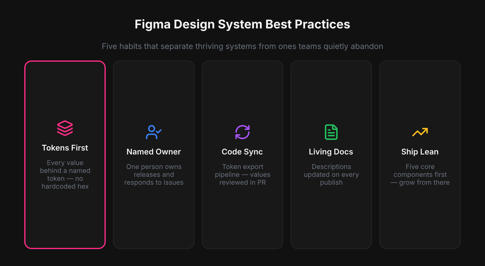
Token-first structure, one cross-discipline naming convention, auto-layout on every component, and a named governance owner are the four practices that separate Figma design systems that scale from ones that decay. Skip any of these early and the debt is not theoretical — it is a complete re-paint on the first theming request, a naming divergence that engineering silently forks into a parallel system, and a library that grows without ever shrinking. This guide covers the concrete habits for each: token structure, naming, component architecture, accessibility, code sync, and maintenance.
The design systems we saw stay healthy after year one all shared a single structural trait: a named owner with the authority to make release decisions. Libraries without a named owner drift in a predictable pattern - components get added but nothing gets removed, naming conventions diverge because different contributors apply different rules, and the latest version in Figma starts diverging from what engineering is actually using. Governance is not a process overhead on top of the design system; it is the mechanism that makes the system continue to function as the product grows.
Token-First: Foundations Before Components
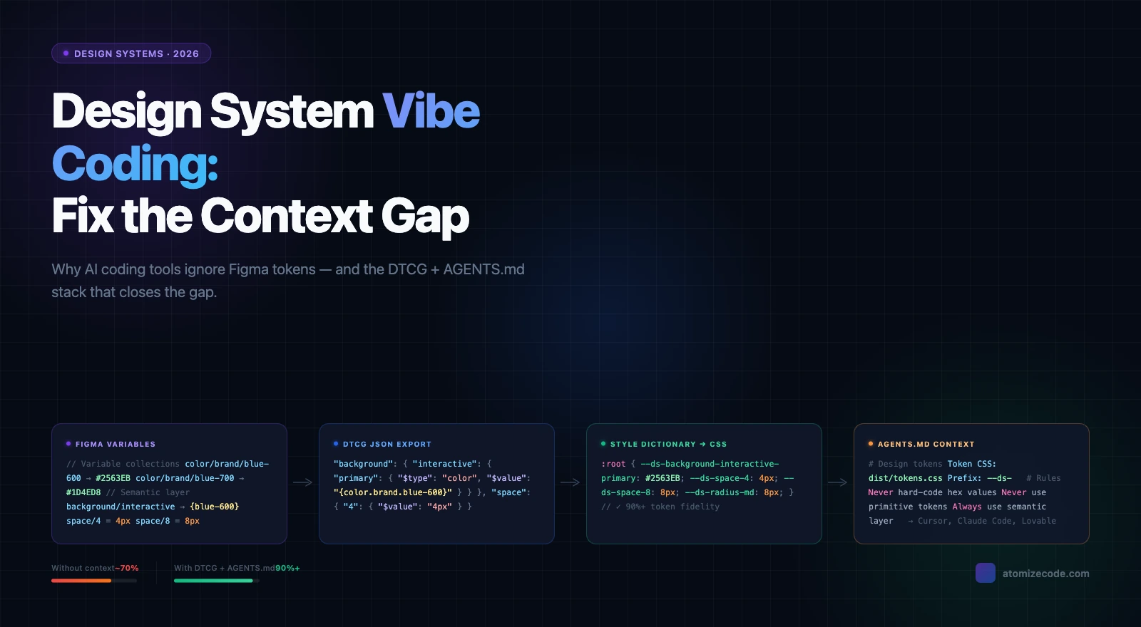
Defining tokens before components is the single structural decision that determines how much rework a design system accumulates over time. Without a primitive and semantic Variable layer in place, every component carries hard-coded hex values — and those values multiply across hundreds of layers before anyone notices. When Atomize worked through libraries built this way, re-establishing tokens meant re-binding every fill, stroke, and text color one component at a time: a week of remediation that a single upfront afternoon would have prevented. Commit to the token layer first, and every component built afterward inherits theming and mode-switching for free.
Practical order: create Primitives — Color (the raw palette), then Semantic — Color (role-based aliases with Light and Dark modes). Add Number variables for spacing and radius. See the Figma Variables guide for full setup details. Only after those collections are stable should the first component be drawn.
One Naming Convention Across Design and Code
A shared naming convention agreed upfront eliminates the most persistent friction in design-to-engineering handoff. Without it, designers name tokens for how they look, engineers name variables for how they behave, and within six months both systems call the same value something different. Atomize exports tokens as CSS custom properties and TypeScript constants derived directly from Figma Variable paths — but only when those paths follow a consistent category/role/variant structure does the export stay coherent. Write the convention down before the first component is built, enforce it in library reviews, and the handoff problem largely dissolves.
- Use
category/role/variantfor tokens:color/background/subtle,spacing/gap/md,radius/md. - Use purpose-based names for components:
button/primary,input/default— neverbutton/blueorbigcard. - Mirror Figma variable paths to CSS custom property names: one-to-one, same casing convention.
- Add the naming guide to the library file’s Docs page so it is never more than one click away.
Auto-Layout and Variables on Every Component
Auto-layout and Variable bindings on every component are not optional refinements — they are the baseline that makes a component library trustworthy for production handoff. Without auto-layout, components break the moment content changes length; without Variable bindings, every fill and text color is a hard-coded value waiting to diverge from engineering. In Atomize's component audits, libraries built without these constraints consistently required the most support tickets, nearly all of them about components that didn't resize or didn't update on theme switch. Apply both from day one and the handoff becomes self-documenting.
Every visual property — fill, stroke, text color, background, corner radius, gap, padding — should reference a Variable. Hard-coded values are where themes go to die. When all values are bound to semantics, switching a top-level frame from Light to Dark mode is one click; the entire UI updates without touching a single layer.
Keep Variants Minimal and Purposeful
Each variant added to a component is a maintenance commitment that compounds with every future token rename, layout refactor, and documentation pass. Teams underestimate this cost because variants feel free at creation time but accumulate silently — until a token rename breaks thirty variant states simultaneously. Vitalina's rule when auditing libraries: a variant earns its place only if it represents a distinct layout or brand hierarchy that appears across multiple product surfaces. Use component properties for everything else, and the system stays manageable without sacrificing coverage.
The practical limit for most teams: 3- 5 variants per component covering hierarchy and the most common states, with component properties handling the rest. A button with primary, secondary, ghost, and destructive variants plus Boolean props for icon, loading, and full-width covers the vast majority of product needs at a manageable footprint.
Eighty well-maintained, documented components beat five hundred stale ones. Surface area is a liability, not an achievement.
Accessibility Baked Into the System
Accessibility baked into the design system multiplies across every product screen that consumes the library — contrast, focus states, and interaction patterns become correct by default rather than by individual effort. The alternative — auditing accessibility after the fact in each product file — costs five to ten times more work for the same coverage. Atomize validates contrast ratios at token-creation time so the semantic layer ships already WCAG-compliant before the first component references it. Lock accessibility into the foundations and every team that uses the library inherits it for free.
- Define color contrast at token creation time: text/primary on background/default must meet WCAG AA (4.5:1 for body text) in both Light and Dark modes before publishing.
- Every interactive component ships with a visible focus variant — not an afterthought, part of the standard component set.
- Form components include disabled and error states as standard variants, not optional additions.
- Use component descriptions to document the required ARIA role, keyboard interaction pattern, and any screen-reader considerations.
- Test at least one complete flow with a keyboard and a screen reader when the first major release ships.
Documentation That Ships with the Component
Documentation co-located with the component is read; documentation in a separate wiki is not. Figma component descriptions appear in the inspect panel at the exact moment a designer is deciding how to use a component — that is the only moment that matters for guidance to stick. Atomize adds semantic intent and contrast pair notes directly to Variable descriptions so the information surfaces inside the tool rather than requiring a context switch to a separate guide. Write one clear sentence of purpose, one sentence of when-not-to-use, and a link to the code implementation: that is the minimum that makes documentation worth having.
Supplement with a Docs page in the library file: anatomy diagrams with spacing annotations, do/don’t usage frames, and interaction notes for complex patterns. For contribution guidelines, migration history, and roadmap, use an external tool (Notion, Storybook, Zeroheight) — but link to it from the Figma file so the library is self-contained as a starting point.
Versioned Releases with Branches and Publish Notes
A design system without versioned releases trains its consumers not to trust it. The moment a component update breaks something mid-sprint and the cause is unclear, product teams start working around the library instead of in it. Atomize treats every publish as a release artifact: branch for the change, review with a developer, merge with a changelog that calls out additions, restructures, and anything requiring migration. That three-step discipline is what keeps teams subscribed to updates instead of diverging to local copies.
Every library publish deserves a changelog with three sections: what was added (new components, new token collections), what changed (restructures, token renames), and what broke (anything requiring migration). Post it the day of the publish. For mature systems, align publish numbering to semantic versioning (major.minor.patch) so product teams can assess impact at a glance.
Token Export Closes the Design-Code Gap
A token export pipeline is what converts a Figma design system into shared truth — without it, design and engineering are running parallel systems that diverge on every change. The gap is invisible for months and then catastrophic when a rebrand requires updating values in two places that were never formally connected. Atomize generates JSON, CSS custom properties, and TypeScript directly from Figma Variables, and the export is treated as part of every library release: reviewed in a pull request, merged to the repo, and version-tagged alongside the Figma publish. When that pipeline is in place, a single token change in Figma propagates to production code without a handoff conversation.
The result: when a designer updates color/interactive/default from blue/500 to blue/600 in Figma, the CSS variable --color-interactive-default updates in the next token file merge. Design and engineering stay in sync without a handoff conversation.
Adoption Is a Product Responsibility
Adoption requires active investment after publish — libraries that are made available but not actively supported lose to local workarounds within months. The root cause is friction: if a designer cannot find the component, get a question answered quickly, or trust that the component is maintained, they recreate it locally and the system fragments. Vitalina's adoption playbook is default-enable the library in every new file, run a 30-minute onboarding for every new team member, hold monthly office hours, and respond to issues within 48 hours. Those four commitments are what the difference between a library people use and one people have.
The single most impactful change across every Atomize onboarding was also the smallest: switching the team library to default-on for new files in the team settings. Before that change, designers opened a blank file, could not find the components in the Assets panel, and created local duplicates instead. After it, adoption was passive — the library was present before the first component was dragged. That one setting eliminated the majority of 'I can't find it' support questions on every team we tracked.
- Post a “what’s new” note with every library release — the primary communication that keeps teams on system.
- Track adoption metrics: files linking the library, component insert rates, and support ticket volume to measure system health over time.
- Hold monthly office hours for contribution proposals and questions — surfaces recurring pain points before they become workarounds.
- Respond to issues within 48 hours; a system that ignores its consumers loses them to local workarounds.
Quarterly Audits and Explicit Deprecations
Quarterly audits are the mechanism that prevents a design system from becoming a museum of superseded decisions. Without scheduled cleanup, tokens accumulate from one-off experiments, components with zero real usage stay in the library because no one declared them dead, and the surface area becomes a trust problem — designers stop trusting the library to surface the right component because there are too many indistinguishable options. Atomize tracks component insert counts and flags zero-usage items for review; the output of each quarterly audit is a deletion list, a deprecation list with migration paths, and a set of updates. A system that shrinks intentionally is a system that teams trust.
Deprecations need a timeline: flag the component in the description (“Deprecated: use button/primary instead”), give consumers 4- 8 weeks to migrate, then remove it in a major version bump. Quiet deletions destroy trust. Explicit deprecations with a migration path build it.
Thriving vs Decaying Design Systems
Key differentiators between systems that scale and systems that decay
| Practice | Thriving system | Decaying system |
|---|---|---|
| Token structure | Primitive + semantic layers, modes for themes | Flat hex values or styles without aliasing |
| Naming convention | Agreed dictionary, mirrored across design and code | Inconsistent, design-only names diverge from code |
| Code sync | Export pipeline, token changes reviewed in a PR | Manual handoff or none; engineering maintains parallel set |
| Documentation | In-file descriptions + external guide, updated on publish | Separate wiki nobody reads after initial publish |
| Governance | Named owner, lightweight intake process | Ad hoc Slack requests, no owner |
| Maintenance | Quarterly audits + explicit deprecation windows | Grows indefinitely; stale components stay in the file |
| Accessibility | Contrast validated at token creation time, focus states standard | Accessibility checked (or not) after the fact |
Related Reading
- What Is a Design System in Figma? - concepts, components, tokens, and when to start
- How to Build a Design System in Figma (Step-by-Step) - audit, token layers, components, and code sync
- Figma Design Tokens: The Complete Guide - Variables, primitive/semantic layers, modes, and DTCG
- Figma Plugins for Tokens, Git Sync & Design Workflows - choosing the right token export, Git sync, or changelog plugin
Final verdict - Design System Best Practices
The four practices that separate scaling design systems from decaying ones — tokens first, a single naming convention, an export pipeline, and active adoption governance — are habits, not advanced tooling. The gap between a library that compounds in value over three years and one that needs a full rebuild at year two is almost never component quality; it is whether these structural decisions were made on day one or deferred. Atomize exists to make the token and export foundations fast to establish so teams can focus on the habits. Get the structure right early and every downstream practice — theming, code sync, accessibility, onboarding — follows without rework.
Tokens before components. Every best practice downstream — theming, accessibility, code sync, rebrand resilience — depends on a clean primitive/semantic Variable structure. Build it first.
Rising library-linked file count, high component reuse rates, short time-to-answer on contribution requests, and declining one-off component creation in product files are the leading indicators. Flat adoption usually means discoverability or trust has failed, not quality.
Strict. Only add a variant when it represents a distinct layout or brand level that cannot be handled by a component property. Most UI components need 3- 5 variants; anything above 8 usually means properties and composition are being underused.
In tokens (contrast validated at semantic definition time), in masters (focus states, disabled states, error states as standard variants), and in documentation (ARIA roles, keyboard behavior, motion sensitivity notes). Not in a separate audit run after the fact.
Agree on one naming convention (category/role/variant is common), document it in the library Docs page and in the codebase README, and enforce it in both library and code reviews. Use a token export tool to generate code-side names mechanically from Figma names so they stay in sync.