What Is a Design System?
A design system is tokens, components, patterns, and docs that keep UI consistent at scale. Learn what it includes, how it fails, and when to build one.
A design system is a maintained set of tokens, components, patterns, and documentation that gives product teams a single source of truth for building consistent UI at scale — so every new screen starts from shared decisions, not a blank slate. Teams shipping across multiple surfaces, running a rebrand, or adding AI-generated UI need one; without it, visual decisions get relitigated every sprint and drift compounds with each release. This article covers what a design system actually includes, how each layer works, and the specific failure modes that cause most systems to decay.
A design system is a set of standards to manage design at scale by reducing redundancy while creating a shared language and visual consistency across pages and channels. - Nielsen Norman Group
What a Design System Actually Is
A design system is not a Figma file, an npm package, or a Storybook instance — it is the agreement those artifacts represent: a maintained, versioned, owned set of shared decisions that connects visual choices to production code. Without that agreement, each tool is just a snapshot that diverges the moment someone forgets to update it. The Nielsen Norman Group defines it as a complete set of standards intended to manage design at scale using reusable components and patterns; in practice, auditing real Figma files at Atomize, the most common gap was teams treating a component kit as a system — no token layer, no release process, and no owner to close the drift. A design system earns that name only when it has all three.
The word 'maintained' is load-bearing in any design system definition. A collection of Figma components that nobody updates is not a design system - it's a snapshot. A design system has an owner, a release process, and a mechanism for keeping design values and code values in sync. Without those, even a well-structured library decays into inconsistency within months.
The Four Layers
Every mature design system has four layers, and the value of each depends entirely on the one below it. Token structure is the foundation; without it, the other three layers are fragile — any rebrand or new mode requires manual updates everywhere. Building Atomize meant reviewing hundreds of real Figma files: the teams with all four layers shipped rebrands as token swaps; the teams missing them spent weeks on manual hex audits. Understand the four layers before building anything.
Most Figma files labeled "design system" are actually static component kits — a pattern found consistently across hundreds of real team libraries reviewed while building Atomize. Tokens sit in Figma Styles rather than Variables, there is no named collection structure, and no mechanism exists to push values to code. Teams discover the gap when the first rebranding request arrives and find themselves manually updating hex values across hundreds of components.
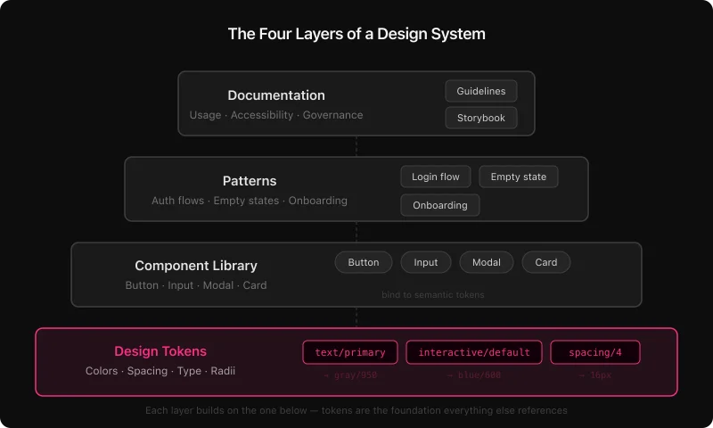
Design tokens
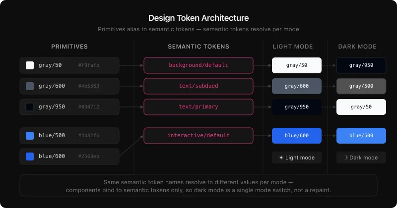
Tokens are named visual decisions: every color, spacing step, type size, border radius, shadow, and motion duration expressed as a named value rather than a raw hex code. The W3C Design Tokens Community Group is standardizing a portable JSON format so tokens can move between tools without custom parsers. In Figma, tokens live as Variables. In code they become CSS custom properties or TypeScript constants - same names, same values, zero drift.
Well-structured token systems use two layers: primitives (the raw palette - gray/50, blue/600) and semantics (role-based aliases - text/primary, interactive/default). Components bind to semantic tokens only. That separation is what makes dark mode a one-mode-switch instead of a manual repaint job.
Component library
Components are reusable, documented UI pieces - buttons, inputs, navigation, modals, feedback banners, data tables. What makes them system components rather than one-off designs is that they bind to tokens, document their variants and states, and update across every linked file when the master changes. A focused library of 40-60 well-maintained components covers 80-90% of UI decisions for most products. For the Figma implementation in detail, the complete guide to building a design system in Figma covers every step.
Patterns
Patterns sit above components. They show how pieces work together to solve recurring UX problems: authentication flows, empty states, onboarding sequences, data table with filters and pagination. A pattern is not a single widget - it's a proven composition with written rationale for why it's structured that way.
Documentation
Documentation is the layer teams most often skip, and the one that determines whether a system actually gets used. Written intent - when to use a primary vs. destructive action, which text styles pass WCAG contrast on dark surfaces, how much padding a card needs at each breakpoint - ships as component descriptions, variable annotations, and deeper guidance on a Docs page. Without it, components get misused at a rate proportional to team size and time since publication.
Design System vs Component Library vs Style Guide
Style guides, component libraries, and design systems are not synonyms — they mark three distinct levels of maturity, each requiring more process and delivering more return. Teams often call a component kit a design system and are surprised when it doesn't scale: without tokens, a code connection, and a governance model, it's still just a snapshot. At Atomize, the teams that got the most value from tooling were the ones who had already closed that gap — their libraries had named owners and export pipelines, not just component frames. Identify which level you're actually at before deciding what to build next.
Design system maturity compared
| Style guide | Component library | Design system | |
|---|---|---|---|
| Visual reference | Yes | Yes | Yes |
| Reusable components | No | Yes | Yes |
| Design tokens | No | Rarely | Yes |
| Code connection | None | Optional | Required |
| Theming / dark mode | No | Manual | Automatic via tokens |
| Governance model | None | Informal | Named owner + process |
| Scales with team | No | Partially | Yes |
A style guide documents decisions. A component library packages them. A design system connects them to production code and gives them a process for staying current.
Why Design Systems Fail
Most design system failures are governance failures, not tooling failures. Teams add tokens, publish a Storybook, and still end up with drift — because no one owns the release process and documentation never gets updated. Auditing Figma files for Atomize, Vitalina found the same pattern repeatedly: a component library with hard-coded hex values and no named maintainer, quietly abandoned after v1. The fix is not a better tool; it is assigning an owner, keeping tokens connected to code, and treating the system as a product with a release cadence.
- Components built without tokens - every hard-coded hex is a future manual update. When dark mode or a rebrand arrives, there's no lever to pull.
- No named owner - a library without a maintainer drifts into inconsistency within months. Someone has to own the release process and respond to issues.
- Documentation written once, never updated - components get misused, workarounds multiply, product teams quietly stop using the system.
- Tokens that never reach code - if design values live only in Figma, engineering maintains a parallel set. Drift is not a risk; it's a certainty.
- Shipping too much too fast - an ambitious v1 that takes six months and ships late gets abandoned. A lean first release that ships in four weeks gets used and grows.
The pattern across thriving systems versus decaying ones comes down to four things: token-first foundations, a naming convention that spans Figma and code, an export pipeline that keeps both sides in sync, and active adoption work - not just publishing a library and hoping. The design system best practices guide breaks these down in detail.
Real-World Design System Examples
The most-studied public design systems — Material, Polaris, Carbon, Atlassian — share four structural choices that explain why they scale when most internal systems don't. Each one treats tokens as a first-class layer, not an afterthought, and publishes both Figma libraries and code packages under the same naming convention. When Vitalina compared these architectures while building Atomize's token export logic, the consistent pattern was explicit pipelines: design values move into production code through a defined process, not a manual copy-paste. Use them as reference architectures, not just inspiration.
- Google Material Design - tiered color tokens built around a tonal palette, Motion spec, components shared across Android, iOS, and web.
- Shopify Polaris - design tokens, a Figma library, and an npm package so the same values live in both design files and the React codebase.
- Carbon Design System (IBM) - open-source, ~40 stable components, all tokens exposed as CSS custom properties and Style Dictionary outputs. Carbon maintains two explicit naming tiers:
$layer-01at the semantic level and$gray-10at the primitive level. When Vitalina built Atomize's token export logic against Carbon's structure, the two-file separation — primitives in one output file, semantics in another — was the only structure that let Style Dictionary generate correct Light and Dark CSS without a custom transform. - Atlassian Design System - semantic token layers for Light and Dark modes, WCAG AA by default, shared across Jira, Confluence, Bitbucket, and Trello.
In all four production-grade systems — Material Design, Polaris, Carbon, and Atlassian — token structures are documented and versioned. Component libraries are published and owned. The pipeline from design values to production code is explicit, not manual.
Why Design Systems Matter More in the AI Era
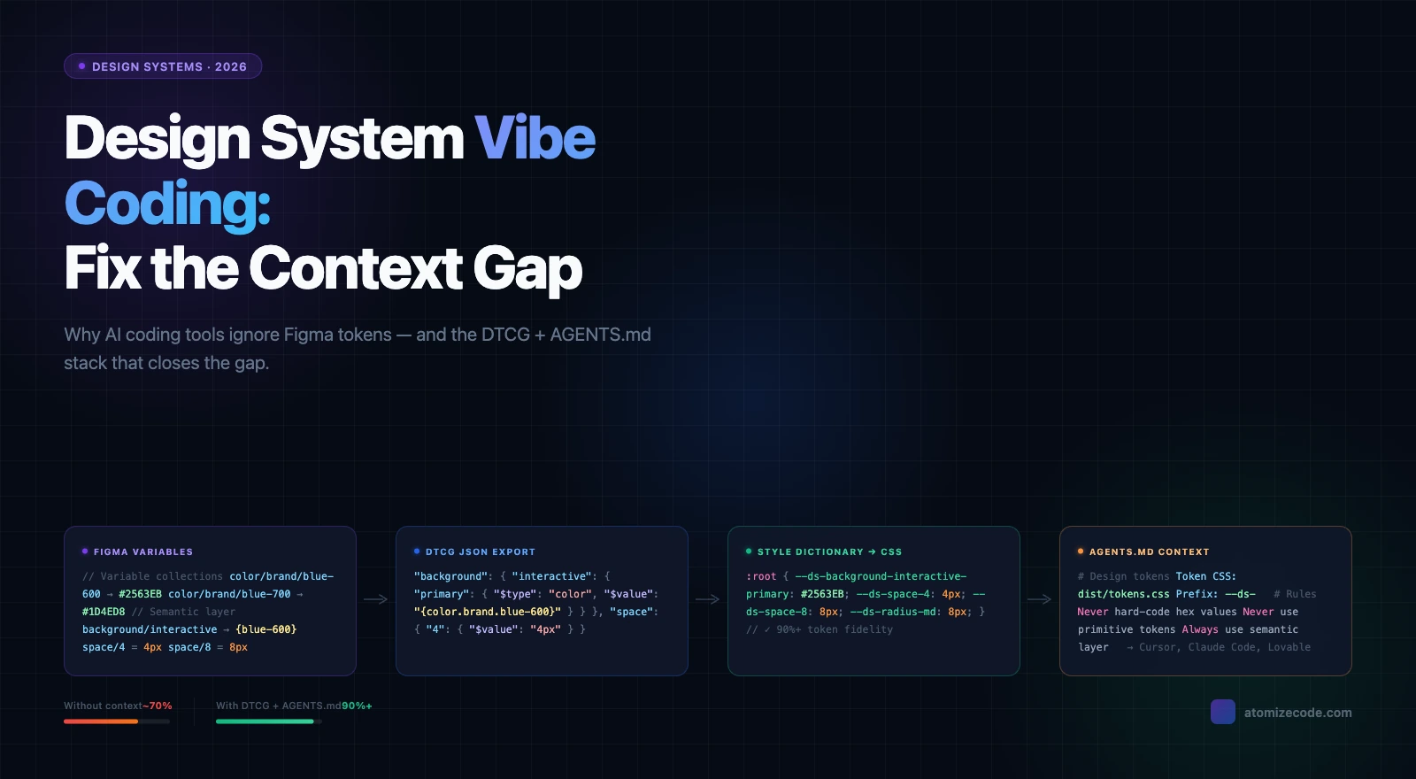
AI coding agents have made a token-bound design system a hard technical requirement, not a best practice. When an agent like Cursor or Claude Code generates a new screen from a Figma spec without token bindings, it invents spacing values and picks the nearest hex — visually close but structurally inconsistent with everything else. Vitalina built Atomize's Figma MCP integration specifically to close this gap: an agent that can read token definitions and component specs directly from a Figma file produces theme-aware, on-brand output without any manual correction. If your team is shipping AI-generated UI, a design system is the constraint layer that makes it coherent.
AI-generated UI is why r/DesignSystems named 2026 'the age of vibe coding' in one of its most upvoted threads of the year: design systems are no longer just a collaboration tool between designers and engineers. They are the constraint layer that makes AI-generated UI coherent at scale. The Figma MCP integration that lets AI agents read token definitions and component specs directly from a Figma file is a direct product of this pressure.
Design system quality: thriving vs decaying
| Dimension | Thriving system | Decaying system |
|---|---|---|
| Token structure | Primitive + semantic layers, code-synced | Flat hex values or styles without aliasing |
| Naming | Agreed dictionary across design and code | Design-only names that diverge from code |
| Code sync | Export pipeline, token changes reviewed in PR | Manual copy-paste; engineering maintains parallel set |
| Docs | In-file descriptions updated on publish | Separate wiki nobody reads after initial publish |
| Governance | Named owner, lightweight intake | Ad hoc Slack requests, no one accountable |
| Maintenance | Quarterly audits, explicit deprecations | Grows indefinitely; stale components stay in file |
| AI readiness | Token-bound components work with MCP/agent workflows | Hard-coded values break AI code generation |
When to Build One
Build a design system when a specific, measurable cost forces the decision — not because it feels like the right time. A vague sense that things should be more consistent rarely survives the effort; a rebrand that requires touching 300 screens by hand, or an accessibility audit that fails because every component is a hard-coded one-off, creates the urgency that gets a system funded and maintained. The clearest signal Vitalina saw when interviewing teams for Atomize: the ones who built sustainable systems had a concrete incident that made the cost of not having one undeniable. If you recognize any of the triggers below, the ROI case is already there.
- A rebrand requires touching 300+ screens by hand
- An accessibility audit fails because every component is a one-off with hard-coded colors
- A new engineer cannot ship independently for two weeks because conventions exist only in people's heads
- A second product needs to look like the first but has already drifted visually
- AI-generated UI code is inconsistent because there's no token layer for it to reference
A lean first version delivers real value quickly: a color and spacing token collection, five core components (button, input, navigation shell, card, feedback alert), a published library, and a named owner. Everything else grows from that spine. For the step-by-step build process in Figma, see How to Build a Design System in Figma. For the token layer specifically, the Figma design tokens guide covers primitives, semantics, modes, and export — and Atomize handles that export step directly inside Figma, turning your Variables into JSON, CSS custom properties, or TypeScript without leaving the design tool.
Final verdict - Design Systems
A design system is infrastructure, not a deliverable. The investment pays off when tokens are connected to code, components are maintained by a named owner, and the system is treated as a product that grows with the team. In 2026, the case for building one is stronger than ever: AI tools generate UI at scale, and a token-bound design system is the only reliable way to keep that output consistent, on-brand, and accessible. Start with tokens, publish a lean component set, connect the pipeline to code, assign an owner. The rest compounds.
A design system is a shared set of named values (tokens), reusable UI pieces (components), higher-level compositions (patterns), and written guidelines (documentation) that lets a product team build consistent interfaces without reinventing decisions on every screen.
A component library is one layer of a design system. The full system also includes design tokens (named values connected to code), usage documentation, accessibility standards, governance rules, and a pipeline that keeps design and engineering in sync. You can have a component library without a system; you cannot scale a system without all four layers.
The most common failure modes are: no named owner (the library drifts and teams stop trusting it), components built without tokens (theming and rebrands break), no documentation (components get misused), tokens that never reach the codebase (engineering maintains a parallel set), and building too much too fast (an ambitious v1 that ships late gets abandoned). All of these are governance problems, not tooling problems.
Always tokens first. Components built without design tokens carry hard-coded values. The moment you add dark mode, a second brand, or a density option, every component requires manual re-painting instead of a simple mode switch. Tokens first means every future change is a lever, not a manual operation.
AI coding tools (Cursor, Claude Code, GitHub Copilot) generate UI code from specs and prompts. Without a token-bound design system, that code invents its own color values and spacing - visually close but structurally inconsistent. With a design system, AI-generated components reference the same tokens as hand-coded ones, making the output automatically theme-aware, accessible, and consistent with the rest of the product.
A useful first release - semantic color and spacing tokens, five core components, a published team library, a named owner, and a token export to the codebase - takes a focused team two to four weeks. Full coverage grows incrementally from that spine; the goal is a first release that ships and gets used, not a complete system that ships late.
The most common stack: Figma for design and component management, Figma Variables for design tokens with Light/Dark modes, Atomize to export those Variables to JSON, CSS custom properties, or TypeScript directly from the Variables panel, Style Dictionary to transform tokens for different platforms (web, iOS, Android), and Storybook or a documentation site for the component API. The exact tools depend on your platform and codebase.
Google Material Design (token tiers, cross-platform), Shopify Polaris (Figma library + npm package with shared token names), IBM Carbon (open-source, CSS custom properties, Style Dictionary outputs), and the Atlassian Design System (semantic token layers for Light and Dark, WCAG AA by default). All four publish their token structure and component documentation openly.